Author: House Plans Guy

  • Get Building Permits Faster With Clear, Code Ready Plans

    Get Building Permits Faster With Clear, Code Ready Plans

    Time is money in homebuilding, and the first place it slips away is often the permit desk. You cannot control every reviewer queue or staffing level, but you can control how easy your plans are to read. When a set answers questions up front, review cycles shrink and starts move forward. Census data shows new single family homes commonly spend about seven to eight months from start to completion, so every week shaved off permitting brings revenue forward. NAHB has also estimated that government regulation makes up a meaningful share of a new home’s final price, which means avoidable friction in approvals adds real cost. The antidote is clarity.

    Why permit speed matters

    Slow permits stack delays. Carry costs climb, trades need to be rescheduled, and sales teams lose momentum. Faster approvals do not come from shortcuts. They come from drawings that are complete, coordinated, and code literate. Reviewers are looking for confidence that the home will be built safely and in line with adopted codes. Give them that confidence on paper and your project moves.

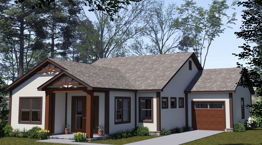
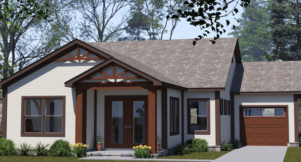
    Start strong with a clear, code aware cover sheet

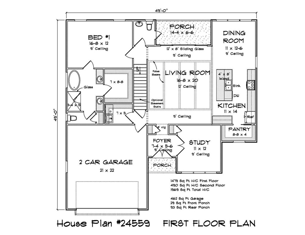
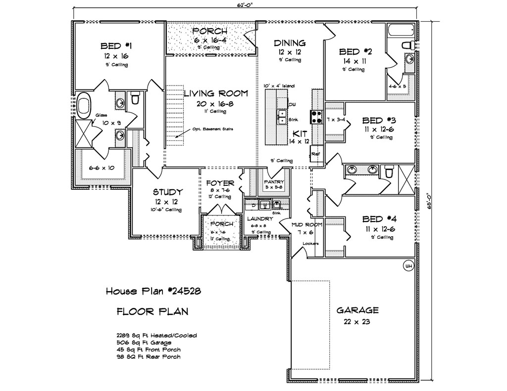
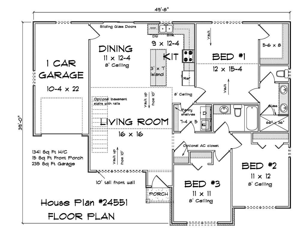
    First impressions set the tone. Page one should spell out the project address, occupancy classification, construction type, adopted code editions, and the key design criteria. List ground snow load, frost depth, basic wind speed and exposure, seismic category, roof and floor live loads, and the energy climate zone. Make the energy path obvious, whether you are using the prescriptive route with listed U factors and R values or a performance route with a compliance report. When these basics are missing, the review stalls before it starts.

    Structure and life safety that pass the tape check

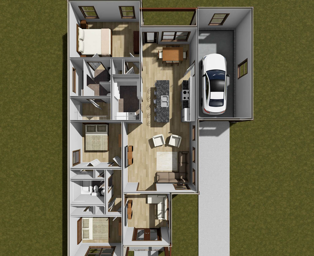
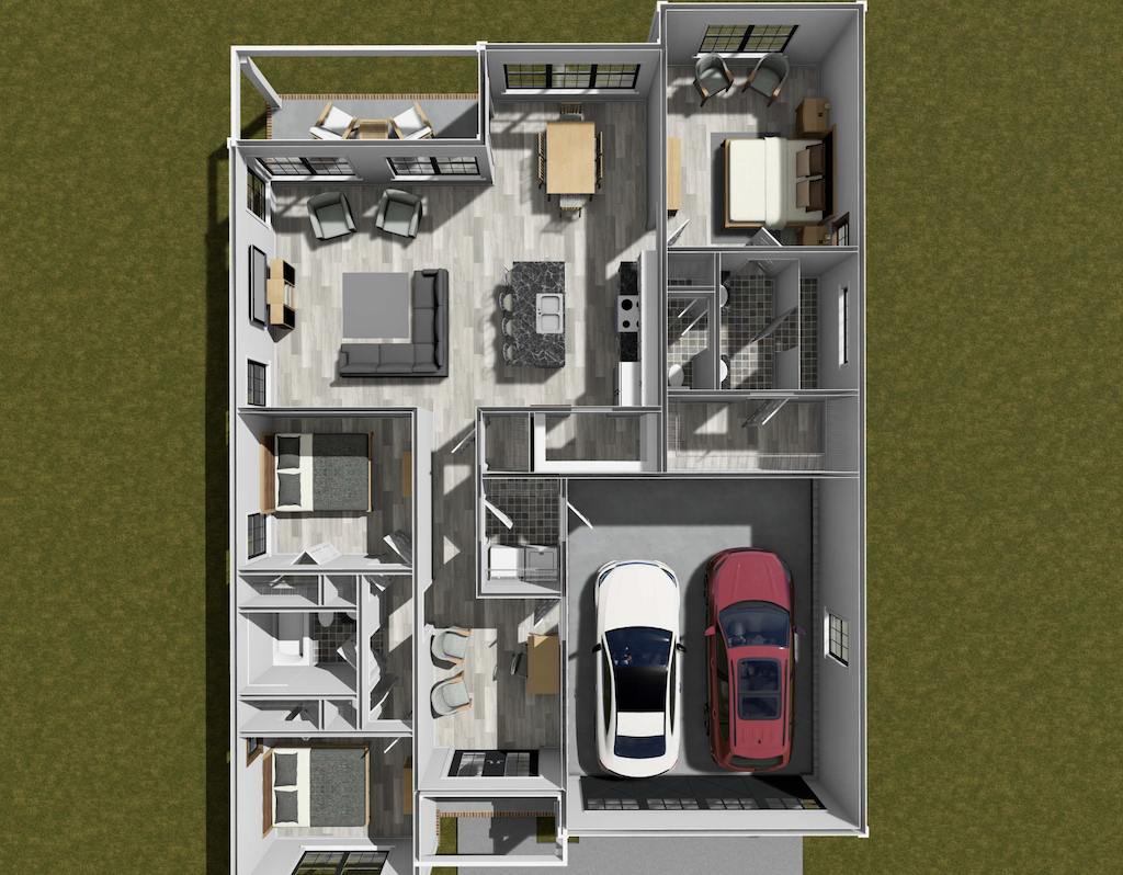
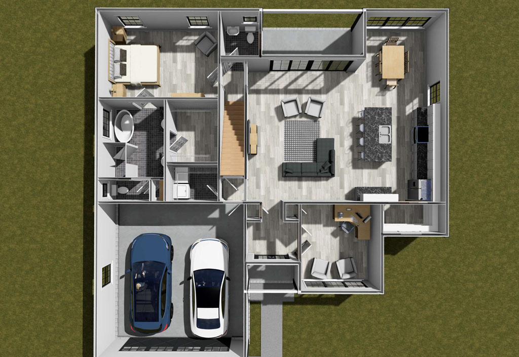
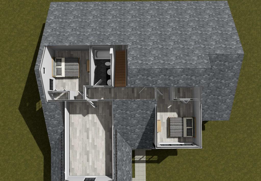
    Residential reviewers scan for a continuous load path and wall bracing that matches the book. Provide a labeled foundation plan with footing sizes, reinforcing, and anchor bolt notes. On the floor plan, call out headers and beams and include a simple schedule. Add a braced wall or shear plan that traces lines, shows panel lengths and methods, and marks hold downs or portal frames at garage openings. If roof trusses are a deferred submittal, say so and show how loads transfer.

    Most resubmittals come down to predictable life safety misses. Show stair geometry with rise, run, headroom, handrail and guard details that pass a tape measure check. Label emergency escape and rescue openings in sleeping rooms with clear rough openings and sill heights. Place smoke and carbon monoxide alarms per code and note interconnection and power source. Detail the garage separation and the door into the house so there is no guesswork.

    Energy and site details that prevent second trips

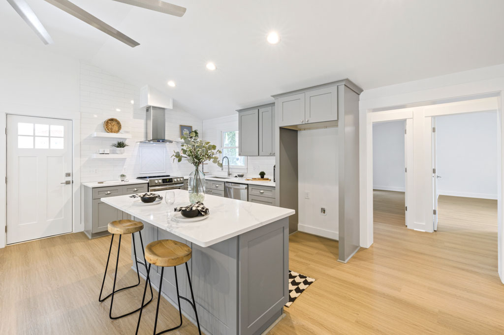
    Energy notes can stall permits when they are vague. List window and door U factors and SHGC that match your climate zone. Note insulation by assembly, air sealing, duct testing where required, and the ventilation approach. If you include a REScheck or performance report, make sure it matches the window and door schedule. Even a light mechanical schematic helps when jurisdictions ask for it, and placing noisy equipment away from bedrooms makes reviewers and buyers happier.

    On tight lots, site clarity is everything. A simple site plan that shows property lines, setbacks, finished floor elevations, driveway slope, downspout locations, drainage arrows, and lot coverage keeps everyone aligned. Many cities also require erosion control notes, utility laterals, and floodplain or wildland interface notes where applicable. Include them the first time and you avoid the second trip.

    How W. L. Martin plan sets move faster

    W. L. Martin Home Designs builds permit readiness into the drawings so you spend less time in the queue. Cover sheets list adopted codes and full design criteria. Floor plans call out egress window sizes where required and show stair geometry that passes in the field. Structural sheets label headers and posts with a clear schedule, and braced wall or shear plans mark methods, lengths, and hold downs so reviewers are not left to infer intent. Elevations and sections align with the notes, which keeps comments focused rather than scattered. Energy compliance is spelled out with prescriptive values on the drawings or paired with a performance report that matches the window and door schedule. Electrical layouts include smoke and CO locations, and site plan templates make setbacks, grades, and downspouts obvious at a glance.

    If your jurisdiction wants sealed calculations, portal frame details at a specific garage opening, a different frost depth, wildland urban interface notes, floodplain elevations, or special inspections, the package can include engineering or local addenda so you submit once and move on. Builders tell us this level of clarity turns long comment lists into short checklists, which means fewer resubmittals and earlier starts.

    The business case is simple. The industry already spends months building after the start, so shaving even a week or two off permitting brings cash flow forward. When your plans speak the reviewer’s language, you reduce change orders, protect schedule, and give your sales team a date they can trust. If you want dependable speed from submittal to stamp, ask about W. L. Martin designs in the 400 to 2,500 square foot range that arrive code aware and reviewer friendly, and tailor the package to your city or county so your next plan hits the counter ready to approve.

  • Compact, Not Cramped Kitchen Design That Sells Small Homes

    Compact, Not Cramped Kitchen Design That Sells Small Homes

    When a home comes in under 2,000 square feet, the kitchen carries the listing. It is where buyers linger, where photos win clicks, and where the floor plan either feels effortless or feels like a compromise. The surprise for many developers is that a small kitchen can punch above its size without blowing the budget. It just needs the right shape, smart clearances, honest storage, and a few performance choices that show up in the first five minutes of a tour.

    Industry surveys keep confirming what you already see on site. NAHB’s What Home Buyers Really Want has long shown kitchen features near the top of buyer wish lists, particularly storage like pantry solutions. Houzz trend data continues to put islands and added storage among the most popular upgrades. Remodeling’s Cost vs. Value reporting shows that sensible kitchen improvements tend to return a solid share at resale compared with many other projects. Translation for builders and BTR operators. Put money where buyers can feel it and your photos will do the rest.

    Shape choices that make small kitchens feel big

    The first move is shape. In compact footprints, four layouts repeatedly live large. A one wall kitchen with an island is clean and perfect for narrow plans. An L shape with an island opens to living and gives you a protected prep corner. A galley that ends on a window works beautifully in townhomes and is fast to build. A tight U shape can deliver the most counter space on slightly wider lots if you avoid deep, dead corner traps. Keep the big three on two walls, not three, and movement gets easier for any cook.

    Clearances that create real flow

    Flow beats finishes, and flow comes from clearances that work in real life. The National Kitchen and Bath Association’s planning guidance is an easy standard to build around. Target about 42 inches for a one cook aisle and 48 inches if two people will be in the space. Leave landing space beside the fridge door and near the range so hot pans have a home. Give the main sink a generous stretch on at least one side so prep does not collide with cleanup. These numbers are not fancy. They are the reason buyers can walk a model and think this just works.

    Storage is where small kitchens fail or fly. A right sized pantry makes a big difference. On many plans, a 24 inch deep reach in with full height shelving or a 36 inch cabinet pantry with pullouts outperforms a token walk in. Go vertical with 42 inch uppers or stacked cabinets to capture cubic feet without widening the room. Use drawer bases where plates and pots live so counters stay clear. Treat corner cabinets like grown ups and use simple blind corner pullouts rather than expensive gadgets that still waste space. Buyers can feel when clutter has been designed out of the picture.

    Appliances can open up space without feeling compromised. The 24 inch category has matured, which means a narrower dishwasher and counter depth refrigeration can free precious inches while still feeling premium. ENERGY STAR’s guidance gives you an easy script for marketing and for utility exposure in rentals. Certified refrigerators use roughly 9 percent less energy than standard models, while certified dishwashers cut energy by about 12 percent and water use by about 30 percent compared with non certified units. Pair a 30 inch slide in range with a 24 inch dishwasher and you get real cooking power plus the cabinet inches you need for storage.

    Appliances, lighting, and ventilation that work quietly

    Light, ventilation, and sound quality are non negotiable, especially in open plans. Put a window at the sink or the end of a galley so the space reads bright in person and in photos. Layer warm white LED under cabinet lighting so the counter stays evenly lit without glare. Choose a quiet, ducted hood that actually clears steam and odor rather than just recirculating it. If dishwashers run during dinner, keep the decibel rating low enough that conversation does not compete.

    Islands, finishes, and small touches buyers love

    The island is the Swiss Army knife in 1,200 to 1,800 square foot homes. Aim for a depth that lets you do storage on both sides and a length that seats four comfortably. If aisles are too tight for an island, a peninsula often delivers the same seating and storage with one less walkway to police. In either case, keep seating comfortable with adequate knee space and stool width so the island looks inviting in photos and functions on pizza night.

    Finish specs can do double duty for marketing and maintenance. A light mid tone quartz tends to hide crumbs better than pure white while still reading bright. A simple shaker or slim rail door in a satin finish is easy to touch up and looks right across multiple elevations. Full height splash behind the range photographs beautifully while a modest splash elsewhere controls cost. In BTR, step up hardware quality one notch to reduce service calls. Houzz trend reporting continues to show that islands, quartz, and under cabinet lighting earn their keep in buyer satisfaction and in listing images.

    Exceptional conveniences

    Do not forget the little conveniences that signal a thought through plan. Put a duplex outlet in the pantry for small appliances, hide a charging drawer in the island so cords do not take over the counter, and stub a data line to the fridge location so a future smart package does not require surgery. These touches are inexpensive and easy to standardize across a series.

    The business case is straightforward. Kitchens sell houses, and functional small kitchens sell faster. NAHB’s long running buyer research, Houzz preference trends, and Cost vs. Value returns all point in the same direction. Deliver a kitchen that moves with 42 inch aisles, hides clutter with honest storage, provides seating that feels generous, and photographs clean. Your absorption improves, your buyer pool widens, and your appraisal conversations get easier.

    W. L. Martin Home Designs leans into this approach across plans from 400 to 2,500 square feet. You will see islands that seat four without crowding, L shapes and galleys that hit NKBA clearances, pantry solutions tucked under stairs or beside the fridge wall, and appliance packages that include 24 inch options for narrow lots. Many plans place the sink on a window wall for flattering light and keep loud mechanicals away from the cooking zone so conversations stay easy. If your community needs a peninsula instead of an island, a bigger pantry in the same footprint, or a cabinet module that repeats across multiple elevations, those tweaks are straightforward.

    For teams that like a quick punch list, focus on these wins you can repeat without fuss. Keep aisles around 42 inches, give the fridge and range real landing space, prefer drawer bases, plan an island or peninsula that seats at least three, specify a quiet ducted hood and under cabinet lighting, and standardize cabinet runs and appliance openings across models. Small moves, big impact.

    Want to point buyers to plans where the kitchen does the selling. W. L. Martin has several ready to go, and the team can adjust clearances and storage to hit the sweet spot for your lot mix and budget.

  • Hybrid Ready Homes: Floor Plans With Home Office and Study Options

    Hybrid Ready Homes: Floor Plans With Home Office and Study Options

    Hybrid work is not a blip. It is simply how millions of people organize their week now, which means the floor plan has to carry more weight than it used to. The good news for developers is that thoughtful, work friendly layouts do not have to be large or expensive. A few smart moves in the 1,000 to 2,000 square foot range can make a home live better, list better, and sell faster.

    If you want the quick context. McKinsey’s American Opportunity Survey found that 58 percent of workers have the option to work from home at least one day per week and 35 percent can do so five days per week, and when people have the option 87 percent take it at least some of the time. That survey is widely cited because it confirms what buyers are feeling on the ground. Pew Research Center reported in 2023 that among workers whose jobs can be done remotely, hybrid became the most common arrangement and more than a third were fully remote. Gallup’s 2023 reporting reached the same conclusion. Hybrid is stabilizing as the preferred setup for remote capable roles. In other words, a real home office is no longer a nice to have feature. It is table stakes for a large slice of the market.

    Below are the design choices that reliably make a difference, pulled from what buyers ask for and what appraisers and inspectors actually see in the field.

    A real office, not a leftover corner

    The dining nook with a laptop is past its prime. What works now is a compact but intentional room that can close off and that feels good on camera. Aim for 8 by 10 feet or larger if possible. Place it near the entry but with acoustic separation so calls do not bleed into the living room. A glazed door keeps light moving while a solid core slab and weatherstripping keep sound where it belongs. If the lot and plan allow, give this room its own exterior door. That small tweak supports client drop ins, tutoring, or just a quiet entrance during nap time.

    Many W. L. Martin Home Designs plans already include study rooms, pocket offices tucked off the entry, and optional exterior access to a study. Those touches translate directly into day to day usability for remote workers and freelancers.

    Plan for two remote workers, not one

    Plenty of households now have two people taking calls. Treat the office plus a secondary focus space as standard. That second zone might be a niche with a built in desk on the landing, a window bay with a counter in the primary suite, or a bedroom that converts with a wall bed. Give each zone a hardwired data jack, two standard outlets on separate circuits, and a quiet return air path so HVAC noise does not hijack a call.

    Light that flatters and reduces eye strain

    Video calls made everyone an amateur lighting designer. Favor north or east light for offices to avoid harsh shadows. If the only option is west facing, add a small roof overhang or exterior shading and specify soft white interior fixtures around 3000 to 3500 Kelvin with high CRI. Simple rules work. Put the window in front of or beside the desk, never directly behind it. Add a ceiling fixture on a dimmer plus a task light at the desk. It looks better and it feels better at 3 p.m. when eyes are tired.

    Quiet is a feature buyers can feel

    Noise is the number one complaint about improvised offices. You do not need exotic details to fix it. Use a solid core office door. Insulate the office walls with mineral wool. Decouple one side of the shared wall with resilient channel if budget allows. Keep loud spaces like laundry, powder rooms, and the fridge wall away from the office when possible. These moves are inexpensive on paper but they add up to a perceptible difference during a showing.

    HVAC and fresh air that do not distract

    A comfortable office is one where the vent does not howl into a headset. Use a larger supply register with a lower face velocity in the office and consider a dedicated return or transfer grille that keeps the door from whistling. Balanced ventilation with an ERV is increasingly common in efficient homes. That lines up with all electric strategies and with wellness focused buyers. It also keeps the office from getting stuffy during long calls.

    Connectivity that just works

    Wi Fi is great until it is not. Run at least one Cat6 data jack to every likely desk location and to a central media panel that can host a router and a small UPS. Conduit from the exterior to the panel preserves future flexibility for fiber or satellite internet. If you like repeatable details, specify a simple tech closet layout with a vented door and a duplex outlet on a dedicated circuit. Small effort, big payoff.

    Flexible storage that looks neat on camera

    Background clutter reads as stress. Built in shelving or a shallow closet in the office lets buyers hide printers, sample kits, and cords behind doors. A 24 inch deep cabinet run with a countertop can double as a standing desk and a video backdrop. If you are building a series, standardize a clean, simple millwork package that looks custom without the custom price.

    Outdoor work zones that truly work

    A small covered patio off the office or living area can double as a fresh air work spot for part of the year. Add a duplex outlet, a ceiling fan, and a step light. Position for shade during prime work hours. Buyers respond well to homes that offer multiple places to take calls, and this is an easy way to create one more.

    Space planning that sells in any market

    Developers do not need larger homes to deliver better work from home. They need smarter adjacencies. The patterns that perform are consistent across markets. Office near the front with optional exterior door. Open living in the middle. Bedrooms grouped for quiet in back or upstairs. Laundry clustered near bedrooms or garage, not next to the office. Wet walls stacked to simplify plumbing and to free up quiet walls around the office. Simple rooflines that make future solar and battery tie in easier.

    Why this matters for value and leasing

    Trusted sources keep telling the same story. McKinsey’s data shows the pool of hybrid capable workers is massive. Pew confirms hybrid is sticky, not temporary. Gallup reports that employee preference has settled around hybrid because it balances flexibility and teamwork. On the housing side, the National Association of Home Builders has tracked a steady rise in demand for specialty spaces, and the home office ranks near the top of buyer wish lists in recent years. Harvard’s Joint Center for Housing Studies has also noted the way pandemic era shifts reshaped design priorities, with space for work and study consistently cited in homeowner surveys.

    You can feel this in leasing statistics and on tours. When a plan gives a buyer two legitimate places to work, they stop trying to mentally force a desk into the dining room. That reduces friction and it widens your pool of qualified buyers or renters.

    A quick developer checklist

    • Provide one dedicated office plus a secondary focus spot
    • Solid core office door with perimeter weatherstripping
    • Insulated office walls, optional resilient channel on one side
    • Two data jacks and four outlets at the main desk wall
    • North or east light preference, dimmable overhead plus task light
    • ERV or balanced ventilation and a quiet supply register
    • Optional exterior door to the office where the lot allows
    • Built in storage that lets the room stage cleanly in minutes

    How W. L. Martin Home Designs fits in

    W. L. Martin Home Designs offers several plans across 400 to 3,500+ square feet that already bake in this thinking. You will find true study rooms instead of improvised corners, pocket offices off the foyer, and optional layouts with easy exterior access to a study so clients or students can come and go without crossing the whole house. Many plans include secondary focus nooks, smart wiring stubs for hardline internet, and quiet mechanical placement that respects call time. If you are building in a community that skews hybrid, our team can also adapt top sellers with a lockable study, more acoustic separation, or a different window orientation to tame afternoon glare.

    Hybrid work is here to stay, and buyers have learned what makes a home easy to work in. Give them quiet, light, and just enough separation. Keep the structure simple so the budget behaves. Then market the plan clearly as hybrid ready. If you would like plan suggestions, we can point you to W. L. Martin designs with studies, exterior access options for those studies, and flexible layouts that make work from home feel effortless.

  • How Exterior Color Supercharges Curb Appeal for New Builds

    How Exterior Color Supercharges Curb Appeal for New Builds

    When you are building new, the floor plan and square footage carry a lot of weight. But the first thing buyers notice is not a bedroom count, it is the face of the home. Exterior color shapes that first impression, signals quality, and can even nudge the sale price. For developers working across entry level footprints up to about 2,500 square feet, a thoughtful color strategy is one of the most affordable ways to stand out on the street and online.

    At W. L. Martin Home Designs, we lean into that idea. Dozens of plans on our site are rendered in unique color palettes that are chosen to spotlight architectural details like gables, brackets, dormers, and porches. From compact 400 to 1,000 square foot cottages to efficient 1,800 to 2,500 square foot family homes, you will see how the right palette can make a plan feel tailored and memorable.

    Why color matters more than most people think

    Color is not just visual, it is emotional. Calming blues and misty grays read clean and coastal. Earthy greens communicate nature and stability. Inky charcoals project modern confidence when paired with crisp trim. That emotional read happens fast, which is why high performing exteriors almost always combine a body color, a trim color, and a small accent for contrast.

    Popular and trusted sources have been underscoring this for years. Zillow’s paint color research has repeatedly found correlations between certain exterior and door colors and stronger sale outcomes, including the widely cited finding that black front doors were associated with a bump of roughly several thousand dollars in sale price in earlier analyses. The National Association of Realtors has highlighted curb appeal projects, including exterior painting, as cost effective upgrades that improve buyer interest and help listings show better in photos and at open houses. Major paint brands like Sherwin Williams and Benjamin Moore keep pushing complex neutrals, desaturated greens, and near blacks because homeowner surveys show confidence in these palettes and strong perceived value when paired with modern windows and roofs.

    The takeaway for builders is simple. Color is not just about liking navy more than tan. It can influence perceived quality, photo click through, and how fast your spec sells.

    Modern color moves that are winning now

    Here are palettes and pairings that buyers are responding to in new construction, pulled from trends covered by Houzz, HGTV, Architectural Digest, and the annual color direction from leading paint companies.

    • Deep charcoal body, warm white trim, stained wood accents. Reads modern without feeling stark, works with black windows and standing seam roofing.
    • Desaturated green body, stone base, satin black windows. Connects to the landscape and looks premium in wooded or lakeside settings.
    • Creamy off white body, bronze metal accents, medium walnut door. A softer take on the modern farmhouse look with better long term versatility.
    • Soft greige body, putty trim, slate roof tone. Classic and buyer friendly, photographs beautifully under both sun and overcast light.
    • Navy or ink blue body, bright white trim, natural cedar brackets. High contrast that highlights gables and porch geometry.
    • Two tone modern. Dark body at the main massing, lighter vertical siding in bump outs, and a color matched garage. Adds depth without feeling busy.

    Front doors are a small but high impact move. Black, charcoal, deep teal, or a rich wood tone tend to test well because they frame the entry and anchor the elevation. Zillow’s earlier findings about black doors line up with what stagers and agents report in the field, that a dark, well finished door reads secure and upscale.

    How color can showcase the architecture

    Great plans deserve to be seen. Color placement is the trick.

    • Use the body color to quiet the largest planes so the form reads cleanly.
    • Use trim intentionally so rakes, fascias, and window casings pop in a controlled way. This is where a crisp white or warm off white earns its keep.
    • Reserve the darkest value for the thinnest lines, for example window frames or metal accents. This creates definition without heaviness.
    • Change siding orientation with color in mind. Vertical boards in a slightly lighter value can make a bump out feel taller. Horizontal lap in a deeper value can ground the mass.
    • Treat stone and brick as colors, not just materials. Match undertones so the palette feels intentional.

    Across our catalog, you will see these tactics at work. Many W. L. Martin Home Designs plans use distinctive colorways to emphasize features like shed dormers on narrow lot cottages, timber brackets on mountain craftsman fronts, or the low, horizontal lines of modern prairie inspired elevations.

    Data points developers like to know

    You do not need an art degree to make a smart color choice. You just need to know what the market is already telling us.

    • Zillow’s paint color analyses have tied specific shades to measurable sale premiums, including black doors associated with around a six thousand dollar lift in older studies, and deep grays testing well on modern exteriors when balanced by warm accents.
    • The National Association of Realtors has reported that exterior paint upgrades are among the curb appeal projects that help homes show better and recover a meaningful portion of their cost at resale, especially when coordinated with simple landscaping and a clean entry sequence.
    • Major paint brands publish annual homeowner surveys that consistently show strong buyer confidence in complex neutrals, muted greens, and near blacks on exteriors, with a preference for matte and satin sheens that photograph well.

    Even when the exact premium varies by market and year, the pattern is steady. Tidy, modern palettes that feel coordinated tend to sell faster and with fewer concessions.

    A quick, practical color process

    Use this checklist to pick a market ready palette for your next build.

    1. Start with fixed elements. Roof color, stone, brick, and window finish are your anchors. Choose body and trim colors that complement those undertones.
    2. Consider light. Dark palettes look best with meaningful soffit lighting and generous window area. In full sun markets, slightly lighter values reduce fade and heat.
    3. Pick one moment. Choose either the door, shutters, or brackets to carry the accent. Restraint reads more expensive than scattering accents everywhere.
    4. Test big. Paint at least a two by two foot swatch on primed material and view it morning, noon, and dusk before approving.
    5. Mind maintenance. Satin or matte sheens hide imperfections better than glossy finishes, and mid tone colors show dust and pollen less than ultra darks in many climates.
    6. Think buyers. If the home sits under 1,800 square feet and targets first time buyers, lean classic with a little contrast. If it is a custom feeling spec near 2,500 square feet, you can push to a richer, moodier body color with warm accents.

    How W. L. Martin plans make color work for you

    Because so much of our portfolio is designed for efficient footprints, we prioritize elevations that gain presence from smart color. Dozens of W. L. Martin Home Designs plans on the site are shown with unique palettes that highlight the architecture, for example lighter gable insets that make rooflines read crisp, dark window frames that sharpen the grid, and warm wood tones that add a welcoming focal point at the entry. If you are browsing for a narrow lot plan or a build optimized for speed and value, these renderings double as ready made color roadmaps.

    Exterior color is one of the simplest levers you can pull to boost curb appeal, improve listing photos, and help buyers fall in love before they reach the front step. The market data from sources like Zillow, NAR, and leading paint brands points in the same direction. Coordinated palettes with clear contrast and a single accent read newer, cleaner, and more valuable.

    Ready to see how color can elevate your next build. Explore W. L. Martin Home Designs, where many plans already showcase colorways that do the heavy lifting, and use those palettes as a springboard for your lot, climate, and buyer profile.

  • Combined Laundry and Pantry Rooms Are Here: Space-Saving Design for Small Homes

    Combined Laundry and Pantry Rooms Are Here: Space-Saving Design for Small Homes

    Smaller homes thrive on smarter square footage. That is the thinking behind a new feature we are rolling into select W.L. Martin Home Designs plans: a combined laundry and pantry. If you have ever tried to fold towels while juggling grocery bags, you already know why this pairing works. It brings storage, appliances, and everyday chores together in one efficient hub that saves steps and frees up floor area for the spaces you use the most.

    You can see this idea in action in our Plan #24558, a 1,395 square foot home with 3 bedrooms, two full bathrooms, a study room, and an attached 1 car garage. The combined laundry and pantry concept fits naturally in a home of this size, and it translates just as well to our smaller builds around 1,200 square feet. By unifying two utility spaces that often sit back to back, we reduce redundant walls and doors while creating a single, highly organized room that supports real daily routines.

    Why a combined laundry and pantry saves space

    In many small to mid-size homes, the pantry and laundry compete for precious square footage near the kitchen and garage entry. Merging them recaptures circulation space that would otherwise be lost to separate hallways or transitional zones. That reclaimed area can fund a larger kitchen island, a window in the dining nook, or a little more breathing room in a primary suite.

    It also simplifies the mechanical core of the home. Shared plumbing, power, and ventilation lines shorten runs and reduce complexity. Fewer penetrations and shorter duct routes can help trim costs and improve performance. The result is a compact utility hub that lives where it is most useful, typically adjacent to the kitchen or near the garage drop zone.

    Everyday convenience you can feel

    A good house plan is not just about dimensions, it is about how a home helps you move through a day. The pantry-laundry blend connects dots that are already close together. Groceries come in from the garage and land on a counter that doubles as a folding surface. Bulk paper goods live beside the detergent, easily restocked. A high shelf holds small appliances you do not want on the kitchen counters. Hampers and pull-out bins sort laundry, recycling, and pet supplies in one place.

    Here is how the combined room pulls its weight for buyers and builders alike:

    • Fewer walls, more livable feet: One shared room replaces two small ones, which reduces doors and dead-end corners. Those saved feet can go where buyers feel them, like a wider great room or a larger shower.
    • Shared utilities, simpler builds: One location for water, drain, 240-volt power, and venting streamlines installation and can lower change orders during construction.
    • Cleaner kitchen lines: Food storage moves out of the main kitchen envelope. The kitchen stays tidy, with less visual clutter and more uninterrupted cabinet runs.
    • Better traffic flow: A single entry with a pocket or full-height door reduces pinch points in the kitchen-hallway zone, which makes smaller homes feel open.
    • Flexible storage for real life: Adjustable shelves, tall cubbies for brooms, a spot for a second fridge or freezer, and labeled bins that can shift as household needs change.

    Design details that make the most of the room

    The magic is in the layout. Keep appliances and shelving working together rather than competing. Consider a stackable washer and dryer to gain a tall pantry cabinet. If side-by-side units are preferred, a continuous counter above becomes a landing zone for groceries and a folding surface. Use full-height cabinets for bulk storage and a mix of pull-outs and open shelves for items reached daily.

    • Door strategy: A pocket or full-swing door keeps the room quiet and contained. Soft-close hardware helps when hands are full.
    • Noise and comfort: Insulate interior walls and choose a solid-core door to keep laundry sounds out of living areas.
    • Light and power: Task lighting under shelves, a bright ceiling fixture, and dedicated circuits for appliances prevent shadows and overloaded outlets.
    • Wet zone planning: Place a laundry sink near the washer for pretreating, and keep it close to floor drains when possible.
    • Vertical organization: Label-friendly bins, can risers, and pull-out trays make the most of every inch from floor to ceiling.

    Built for today, adaptable for tomorrow

    Trends come and go, but efficiency stays valuable. A multifunction utility room works for first-time buyers, growing families, and downsizers who want less house with more usefulness. It pairs well with smart-home appliances, evolving pantry habits like bulk buying, and the desire to keep the kitchen serene. If needs shift later, the space can accommodate a second refrigerator, a hobby station, or additional pet care storage without reworking the whole plan.

    W.L. Martin Home Designs offers several plans in the 1,000 to 1,500 square foot range, and many can incorporate this combined laundry and pantry approach. Plan #24558 shows how the idea fits beautifully in a 1,395 square foot footprint with three bedrooms, two full baths, a study, and a one car garage. For homes closer to 1,200 square feet, the consolidation often unlocks room for a better kitchen layout or a more generous entry storage wall.

    For developers and future homeowners

    Developers gain a marketable talking point that buyers understand the moment they walk through the door. One room that does the work of two looks smart on a floor plan, but it feels even smarter when you see the flow in person. It can help differentiate a community of smaller-footprint homes without adding square footage.

    Future homeowners get a space that works as hard as they do. Fewer steps between groceries, laundry, and the garage. Less visual clutter. A place for everything that changes with the seasons and the household.

    If you are exploring small and mid-size home plans that balance cost, comfort, and flexibility, start with W.L. Martin Home Designs. Browse our collection, look for the combined laundry and pantry in select plans like Plan #24558, and reach out if you would like to tailor a layout. We are happy to help you make every square foot count.

  • Minimalism in Home Design Is Not a Fad, It Is Smart Building

    Minimalism in Home Design Is Not a Fad, It Is Smart Building

    Minimalism in residential design has matured from a clean look on social feeds into a practical framework for how new homes are planned, built, and lived in. It is about clarity of layout, restraint in materials, and square footage that works harder. For developers, this is not only aesthetic, it is a path to fewer change orders, faster builds, and stronger buyer appeal. At W. L. Martin Home Designs, we have leaned into this shift for years, which is why so many of our plans already deliver what today’s and tomorrow’s buyers are asking for.

    Why minimalism is gaining momentum

    Several forces are pulling design in the same direction. Households want spaces that are easier to maintain, simpler to furnish, and more energy efficient. The buildings sector accounts for roughly a third of global final energy use and around a quarter to a third of energy related carbon emissions, so every design decision that reduces envelope area, improves daylighting, or optimizes mechanicals matters. Builders continue to navigate labor constraints and material cost volatility, which makes simple forms, repeatable details, and offsite friendly geometry more valuable. Buyer preferences have also shifted toward flexible rooms, uncluttered kitchens, and outdoor connections. Industry surveys from architects and builders show sustained demand for energy efficient features, low maintenance materials, better storage, and right sized plans that do not waste circulation space. Minimalism happens to be a clean way to deliver all of this at once.

    What minimalism looks like in new housing today

    Minimalist homes do not feel empty, they feel clear. The best examples balance warmth with restraint, then back it up with measurable performance. Below are patterns we see again and again in the highest performing new builds:

    1. Simple geometry that reduces corners and jogs, which lowers exterior surface area and air leakage potential while simplifying framing and siding sequences
    2. Open yet right sized living cores, where kitchens, dining, and living connect without excess hallways, a layout that shortens duct runs and shrinks wasted square footage
    3. Natural light by design, with window sizes and placements tuned to orientation, which cuts daytime lighting loads and improves comfort without glare
    4. A tight, well insulated shell, continuous exterior insulation, careful air sealing, and thermally broken details that set the stage for efficient HVAC
    5. Material restraint, fewer finish types used more consistently, which eases procurement, reduces waste, and makes rooms feel calmer
    6. Built in storage that hides clutter, pantry walls, linen towers, drop zones, and primary closets that keep surfaces clear without upsizing the home
    7. Flexible rooms, a pocket office or guest room that can swing between uses so the home adapts as families change
    8. Quiet, efficient systems, heat pumps, balanced ventilation, and induction cooking that lower operating costs and improve indoor air quality.

    The business case for developers

    Minimalism lowers complexity, which lowers risk. Rectilinear footprints, single main ridge rooflines, and stacked wet walls speed framing, plumbing, and MEP coordination. Cleaner elevations with a restrained palette reduce change orders during exterior selections. Windows sized in standard increments help supply chain resilience. In energy, frameworks like ENERGY STAR for new homes establish a baseline that is at least 10 percent more efficient than code, with average savings of about 20 percent compared to typical new construction. Passive building strategies, even when you do not pursue full certification, routinely cut heating and cooling demand by 40 to 60 percent in comparable climates. These are not just green talking points, they show up as smaller equipment sizes, quieter interiors, and lower ownership costs that help buyers qualify.

    How W. L. Martin plans build minimalism in from the start

    We design for developers who need plans that field well on real sites, with crews of various experience levels, and in climates across North America. That is the lens behind our minimalist forward approach.
    • Compact footprints that fit 400 to 2,500 square feet without feeling cramped, with great room cores that carry volume and light while bedrooms and baths remain efficient
    • Structural grids that standardize spans and bearing points, so beams and joists repeat, which speeds framing and supports panelization or truss friendly roofs
    • Stacked kitchens, baths, and laundries that align wet walls vertically, reducing runs and minimizing penetrations through the envelope
    • Clean roof forms, typically a single primary gable or hip with limited intersections, which improves drying, lowers flashing risk, and keeps install time predictable
    • Window schedules optimized around orientation rather than ornament, with larger panes where light is wanted and fewer north facing perforations where it is not
    • Right sized mechanical spaces, dedicated chases for balanced ventilation, and heat pump ready layouts that make high performance packages straightforward
    • Storage where it counts, pantry walls, linen towers, and built in drop zones designed into the plan so the living areas stay uncluttered without inflating square footage
    • Finish palettes that assume a small set of durable, widely available materials, siding in two profiles instead of four, tile in one pattern carried through wet rooms, unified trim strategies
    • Universal design options that keep clearances clean and thresholds low, which makes homes livable for more buyers without visual noise
    • Solar and EV readiness baked in, roof planes that actually accept PV, main panels sized with spare capacity, conduit paths and EV rough in locations shown on the plan

    Three plan types, many minimalist outcomes

    Small footprint ADUs and cottages at 400 to 900 square feet that still live big. Our smallest studios put the kitchen on a single wall with a dining built in, a stacked bath and laundry core, and full height closet walls. Vaulted great rooms borrow volume, tall windows are placed for privacy and light, and storage niches keep surfaces clear. Developers can repeat these with tiny site tweaks and get reliable results.

    Narrow lot plans from 1,300 to 1,800 square feet that maximize width challenged sites. We keep the stair unobtrusive and straight, align kitchens and powder rooms to stack plumbing, and use a single roof ridge parallel to the street. Primary suites are compact but complete, with built in storage instead of an oversized footprint. These plans are friendly to town infill and suburban tracts alike.

    Family ready homes from 1,900 to 2,500 square feet that feel calm, not cavernous. The living core is open and bright, secondary bedrooms share a smart Jack and Jill layout, and a flex room near the entry swings between office, guest, or play. Exterior elevations stay crisp with purposeful fenestration. Energy packages can step up to solar ready, and garages include EV rough ins that do not fight the layout.

    Performance that supports the look

    Minimalism is easier to defend when it is not only pretty. In our plans, simplified geometry tightens the envelope by limiting corners, which reduces air leakage risk. Careful daylighting design reduces artificial lighting during the day and pairs well with high efficiency lighting at night. ENERGY STAR ready details and balanced ventilation strategies support lower utility bills for buyers and quieter interiors that feel like a step up. For developers, these choices also mean fewer specialty transitions, fewer unique details to remember in the field, and less punch list churn at the end.

    Why this is future proof

    The industry is clearly moving toward higher performance expectations, simpler maintainability, and flexible space planning. Minimalism threads these needs together. Simple forms accept exterior updates gracefully as materials evolve. Clean elevations do not go out of style every few years. Energy smart shells make it easier to integrate next generation equipment, from heat pump water heaters to battery storage. When buyers ask for calm, healthy spaces that are easy to live in, plans that lead with clarity will keep winning.

    How we customize for your lots and brand

    Developers often need a recognizable through line across a community, but not copy paste repetition. Our minimalist base plans are designed to flex. We can mirror footprints for site fit, adjust window schedules for orientation, swap in regionally favored materials without fussy trim changes, or package energy options to hit a specific program. Because the geometry is clean and details are repeatable, these changes are efficient to draft and predictable to build.

    If you are looking to meet demand for smaller, smarter, and calmer homes, the W. L. Martin Home Designs portfolio is ready. Minimalism is built in, so you can deliver designs that look current today and age well as codes and buyer expectations rise.

  • How a Plan Choice Put $20,000 Back in a Builder’s Pocket

    How a Plan Choice Put $20,000 Back in a Builder’s Pocket

    A builder recently purchased two plans for the same project. One was a W. L. Martin Home Designs plan, the other from a different designer. Same square footage, similar curb appeal, same finish level. When the bids came back, the estimate to build the W. L. Martin plan was about $20,000 less. Nothing “cheap” was swapped in, and quality was not compromised. The difference likely came from a combination of quiet design choices that can make homes faster and less expensive to build.

    Below is where those savings may come from in real life, and why developers across North America can often see similar outcomes when they build from W. L. Martin Home Designs plans. Every project has variables like labor markets, material pricing, engineering requirements, site conditions, and code environment, so the actual savings will vary.

    Where the savings may come from

    Clean footprints and rooflines

    • Fewer jogs and bump outs reduce linear footage of foundation and exterior wall, which can lower concrete, rebar, siding, and labor.
    • Simple, truss friendly roof geometry may speed framing and cut waste. Subs often price roofs with fewer hips and valleys more aggressively.

    Structural spans that fit standard materials

    • Rooms sized to common truss and joist lengths may avoid specialty members.
    • Point loads and bearing lines aligned to minimize LVLs, hangers, and steel can keep framing costs in check.

    Framing on a 24 inch module

    • Walls, windows, and room sizes coordinated to common sheet goods may reduce cuts and waste. Drywall, sheathing, and flooring land on studs and joists without slivers.
    • Door and window openings optimized for off the shelf sizes can lower unit cost and reduce lead times.

    Foundations that match soil and span logic

    • Straight runs, sensible step downs, and rational pier or thickened slab locations can cut form time and concrete volume.
    • Loads that stack from roof to footing may reduce the need for oversized pads or surprise grade beams.

    HVAC, plumbing, and electrical aligned

    • Wet walls stacked and fixtures clustered can reduce supply and drain lengths.
    • Planned return air paths and duct chases can prevent field built soffits that trigger change orders.

    Stairs and headroom solved on paper

    • Correct riser counts, landings, and headroom clearances may avoid field fixes that cost time and money.

    Window and door schedules that favor availability

    • Repeating sizes and types let you buy in tiers and keep a small set of SKUs for multi unit developments.
    • Framing headers right sized to actual loads can reduce lumber spend compared to default oversizing.

    Documentation that reduces RFIs

    • Clear sections, dimensions, and details often mean fewer phone calls and fewer figure it out moments. Bids tighten, contingencies shrink, and the job moves.

    A realistic way a $20,000 delta might break down

    Every market and spec package is different, but here is an illustrative split the builder could have seen when subs priced both plans apples to apples:

    • Framing materials and labor, fewer LVLs and hangers, cleaner layout: about $6,200
    • Roof system, simpler trusses and less cut waste: about $3,100
    • Foundation, fewer jogs and less formwork: about $4,000
    • MEP rough ins, stacked wet walls and planned chases: about $2,600
    • Windows and doors, standardized sizes and repeats: about $1,800
    • Finishes and waste reduction from modular planning: about $900
    • Soft costs and schedule, fewer RFIs and change orders: about $1,400
      Total estimated savings in this scenario: about $20,000. Your numbers may differ, but the pattern is common.

    Why this can matter even more for developers

    Save even a portion of that per home and a 10 home build adds up fast. That can:

    • Improve project IRR and debt service coverage.
    • Create room for upgraded finishes where they matter most.
    • Support price competitiveness without squeezing margins.
    • Reduce supply chain risk through fewer unique SKUs.
      Developers often win twice, since repeatable details cut cycle times. Crews learn the plan, purchasing locks pricing, and variance goes down.

    The design principles we bake in

    • Square footage that builds easy rather than fights standard material dimensions.
    • Roof forms that read great from the street yet frame quickly.
    • Stacked plumbing and aligned structure to keep trades moving.
    • Code forward details that pass plan review smoothly across North America.
    • Options packaged smartly so elevations and kitchens can vary without changing the skeleton.

    What you can expect with W. L. Martin plans

    • Tighter bids and fewer allowances, since subs understand the work.
    • Shorter framing and MEP durations, which can reduce carry costs.
    • Fewer change orders and less jobsite improvisation.
    • Plans ranging from about 400 to 3,000 square feet, sized for infill, scattered lots, or full subdivisions.

    If you are a builder or developer choosing between two similar plans, the one drawn to build efficiently is the one that protects your margin. That is the difference this builder saw when our plan priced about $20,000 under a comparable design. Explore our plans at wlmartinhomes.com, or tell us your target footprint and spec. We will point you to a plan set that preserves your look, trims your build cost, and scales smoothly across multiple lots.

  • Featured New House Design – Meet Plan #24559 “Maple Hollow” by W.L. Martin Home Designs

    Featured New House Design – Meet Plan #24559 “Maple Hollow” by W.L. Martin Home Designs

    Plan #24559 • 1,969 sq. ft. • 3 beds • 2.5 baths • Study • 2-car garage

    Maple Hollow is a refined two-story that lives comfortably today and stays flexible for tomorrow. At 1,969 square feet, it blends a first-floor primary suite with bright, connected living spaces and the kind of everyday functionality that wins buyer approval in a hurry.

    A layout that works hard for modern life

    Step from the foyer into a quiet, front-facing study that sets up perfectly for work-from-home days or heads-down homework. The heart of the home opens into an expansive living room that connects to a kitchen anchored by a large island with sink, then continues to a rear dining area. The result is a social hub where cooking, conversation, and casual meals flow together. A convenient half bath sits at the rear of the first floor, right where guests actually need it. The attached two-car garage offers practical daily convenience and weather-proof arrivals.

    Primary on the main, comfort on demand

    Maple Hollow places the primary suite on the main level for easy, single-level living when you want it. The suite includes an en suite bath and a walk-in closet, a combination that supports aging-in-place, makes mornings faster, and boosts resale appeal.

    Room to grow upstairs

    Two additional bedrooms and a full bath sit upstairs, separated from the bustle of the main level. Need more flex space? Choose the optional upstairs game room to create a media lounge, playroom, or hobby zone that can adapt as households change.

    The sweet spot in size, with broad market appeal

    At 1,969 square feet, Maple Hollow is sized to perform in a wide range of markets across North America. Based on U.S. Census and major builder surveys through the early 2020s, the typical new single-family home often lands in the low to mid 2,000s for square footage. Maple Hollow comes in just below that average, which can help with attainability and long-term operating costs while still delivering the spaces buyers prioritize.

    Features buyers consistently ask for

    • Open-concept core that keeps the kitchen, living, and dining connected for entertaining and everyday visibility
    • Large kitchen island with sink for prep, serving, and casual seating
    • Dedicated home office or study near the entry, a top preference since the rise of remote work
    • First-floor primary suite for convenience and multigenerational flexibility
    • 3 bedrooms and 2.5 baths, a popular configuration for both families and downsizers who still host
    • Two-car attached garage, a near-universal expectation in most new communities
    • Optional upstairs game room, the kind of flexible bonus space buyers love to personalize

    Why developers like building Maple Hollow

    For spec and scattered-lot builders, Maple Hollow’s program checks key boxes that broaden the buyer pool: main-level primary, true home office, open living, and a clean three-bed layout with an optional bonus. The footprint supports efficient construction and straightforward marketing. It is versatile enough for suburban neighborhoods and many infill opportunities, and it “lives larger” than its square footage thanks to the connected core and smart bedroom placement.

    Get the plan Now, with modification options

    Developers and home buyers can purchase Maple Hollow, Plan #24559, for just $1,005 at wlmartinhomes.com. Want tweaks, like reworking the primary bath, adding built-ins, or dialing in the game room? You can choose to modify the plan so it fits your lot, budget, and brand.

    Ready to bring Maple Hollow or other home designs to your next project? Visit https://wlmartinhomes.com/.

  • Future-Proof House Plans: Designing and Selecting Homes That Stand the Test of Time

    Future-Proof House Plans: Designing and Selecting Homes That Stand the Test of Time

    Whether you’re building your own home or developing properties for a broader market, choosing the right house plan is about more than layout and square footage. It’s about creating or selecting a space that won’t feel outdated just a few years after move-in. A future-proof design helps reduce the need for early remodeling, keeps homeowners satisfied, and protects your investment by maintaining long-term value.

    At W.L. Martin Home Designs, we work with both developers and individual homebuyers who are thinking ahead. Our clients aren’t just picking plans for what looks good today. They’re choosing layouts and architectural elements that will still feel fresh and functional five, ten, or even twenty years from now.

    So how do you choose or design a house plan that won’t age poorly? And what does “future-proof” really mean in residential home design?

    Let’s take a closer look.

    1. Focus on Flexible Spaces

    Trends may change, but flexibility never goes out of style. Floor plans that allow spaces to serve more than one purpose give homeowners the ability to adapt as their lives evolve. Think of a dining room that doubles as a home office, or a bonus room that can serve as a gym, nursery, or guest suite depending on the homeowner’s needs.

    During the pandemic, homes with adaptable spaces became highly sought after. A study from the National Association of Home Builders found that over 60% of new home buyers in 2023 were looking for dedicated flex spaces or home offices. That demand hasn’t faded, and builders who select plans with this kind of flexibility are meeting the expectations of modern buyers without the need for costly modifications later.

    2. Avoid Overly Trendy Features

    There’s a fine line between stylish and short-lived. A specific tile pattern or popular paint color may be on-trend today but can quickly date a home in just a few years. This doesn’t mean every home has to be completely neutral or stripped of personality. It simply means leaning into classic lines, timeless finishes, and a layout that feels intuitive and balanced.

    Design professionals often point to Craftsman, Minimalist Modern, and Transitional styles as safe bets for long-term appeal. Open floor plans, ample natural light, and connections to outdoor living spaces continue to attract a wide range of buyers across different life stages.

    3. Keep Aging in Place in Mind

    Today’s buyers are thinking ahead, especially when it comes to long-term livability. Homes that are easy to navigate and comfortable for all stages of life offer an edge in the market. Wider hallways, step-free entries, main-floor primary suites, and walk-in showers are features that not only support aging in place but also enhance convenience for everyone.

    According to AARP, nearly 77% of adults over 50 want to stay in their homes as they age. Offering plans that support this goal not only improves the homeowner’s quality of life but also protects against the need for costly renovations later.

    4. Prioritize Energy Efficiency and Smart Layouts

    Energy-efficient designs are more than just a selling point. They’re a long-term cost-saving measure for homeowners and a key factor in sustainability. Homes that are well-insulated, strategically oriented for sunlight, and planned around smart HVAC and window placement can significantly lower energy usage over time.

    The U.S. Department of Energy reports that homes built to current energy codes can save up to 30% annually on utility bills. Developers who select efficient plans not only help homeowners save money but also create properties with lasting appeal in a more environmentally conscious housing market.

    5. Design for Long-Term Curb Appeal

    First impressions matter, but so does long-term charm. Homes with well-proportioned exteriors, natural materials, and balanced rooflines tend to hold their appeal far longer than those driven by passing trends. While bold accents and striking contrasts might be eye-catching now, they don’t always age well.

    Instead of chasing what’s trending, focus on designs that feel grounded and timeless. A classic front porch, well-placed windows, and thoughtful landscaping create a look that buyers appreciate year after year.

    6. Select the Right Amount of Space — Not Just More Space

    Square footage alone doesn’t guarantee comfort or practicality. A home that is too large can become a burden to maintain, heat, and furnish. On the other hand, a smaller home with an efficient layout can live much larger than its measurements might suggest.

    In many markets, smaller homes with thoughtful design and smart storage are outperforming larger properties in terms of both speed of sale and long-term value. Developers who choose these types of plans are providing homeowners with more manageable, comfortable living without sacrificing usability.

    7. Choose House Plans That Can Evolve Over Time

    One of the best ways to future-proof a home is to ensure it can grow or adapt as the homeowner’s needs change. Plans that make it easy to reconfigure spaces, add a room, or refresh finishes help extend the life and value of the home. Structural layouts that allow for simple updates and material choices that are easy to replace or upgrade are key elements to look for.

    For developers, this forward-thinking approach builds trust with buyers who are planning for the long haul. When a buyer knows the home can evolve with them, it makes the purchase feel smarter and more secure.

    Designing and selecting the right home plan is one of the most important decisions in the building process. Whether you’re a homebuyer planning for the future or a developer creating properties for a competitive market, future-proofing is a smart strategy. By choosing plans that are flexible, timeless, efficient, and designed for real life, you’re creating homes that won’t need to be reimagined just a few years after they’re built.

    At W.L. Martin Home Designs, we specialize in plans that make sense for today and tomorrow. From compact starter homes to spacious family-friendly layouts, our designs are created with long-term livability and market appeal in mind. Explore our collection to find house plans that help protect your investment and keep your homes current for years to come.

  • Budget-Friendly House Plan Strategies for Affordable Developments

    Budget-Friendly House Plan Strategies for Affordable Developments

    Building affordable housing doesn’t mean sacrificing design or appeal. In fact, the most successful affordable developments today are those that strike the right balance between cost-effective construction and smart, livable layouts. At W.L. Martin Home Designs, we work with developers across North America who are navigating this balance every day.

    With housing affordability continuing to dominate headlines and planning meetings, the demand for well-designed, lower-cost homes is at an all-time high. According to the National Association of Home Builders (NAHB), regulatory, material, and labor costs have pushed the average price of a new single-family home over $500,000 in many areas. For developers, this means finding innovative ways to bring down costs without cutting corners.

    Here are some proven strategies developers can use when selecting and building with budget-friendly house plans.

    Choose Simple, Efficient Footprints

    The shape of a home is one of the most overlooked areas where cost savings can add up. Simple, square or rectangular footprints reduce foundation costs, streamline framing, and minimize material waste. These types of layouts are also faster for crews to build, which helps with labor efficiency.

    Plans that limit unnecessary corners or bump-outs tend to be easier to frame and side. For example, a 1,200 square foot home with a rectangular design can often be framed more quickly than a 1,000 square foot home with complex angles and overhangs.

    Go with Straightforward Rooflines

    Roof complexity is a big factor in both labor and material costs. Multi-pitch rooflines, intersecting gables, and decorative dormers can all look great, but they also drive up your budget. A clean gable or hip roof is usually the most cost-effective option, especially for affordable builds.

    A report by Remodeling Magazine shows that roofing material and labor can account for up to 15 percent of total home construction cost, depending on the style. Simple rooflines not only reduce framing time but also lessen long-term maintenance.

    Prioritize Shared Plumbing Walls

    One of the best tricks in the book for keeping mechanical costs in check is to stack or group plumbing. House plans that place bathrooms back-to-back or above one another in two-story homes allow for shared wet walls, which cuts down on piping, labor time, and HVAC complexity.

    Laundry rooms located near kitchens or bathrooms also benefit from this shared utility routing. Keeping water-based rooms close together can reduce plumbing costs by hundreds or even thousands of dollars per unit.

    Design for Slab-On-Grade Foundations When Possible

    In markets where it makes sense, slab-on-grade foundations can offer significant savings over crawlspace or basement foundations. These slabs are especially popular in southern U.S. regions or anywhere with high water tables.

    According to the U.S. Department of Housing and Urban Development (HUD), a slab foundation can save developers anywhere from $5,000 to $15,000 per home depending on site conditions. Many of our plans at W.L. Martin Home Designs are already designed to work with slab foundations or can be adapted easily.

    Minimize Unused Square Footage

    Every square foot you build costs money, so designing a home that makes the most of its space is critical. Open floor plans that combine the kitchen, dining, and living areas not only feel larger, they also eliminate the need for extra walls and finishes.

    Secondary spaces like oversized foyers, redundant hallways, or underused formal dining rooms can be redesigned or eliminated altogether. The goal is to maximize usable space for the homeowner while keeping the construction footprint tight and efficient.

    Select Cost-Smart Exterior Materials

    Curb appeal matters, but you don’t need high-end siding or elaborate trim details to make a home look great. Today’s budget-friendly materials like fiber cement siding, architectural asphalt shingles, and prefabricated porch elements offer strong durability and visual interest without the premium price tag.

    By keeping exteriors clean and simple, you free up budget to spend on interior finishes that buyers will notice more, such as kitchen surfaces or lighting fixtures.

    Offer a Limited Number of Plan Variations

    It might be tempting to offer a wide range of floor plans, but sticking to a core group of designs can lead to major cost savings. Using repeatable plans across multiple lots means your crews get familiar with the layout, material orders become more consistent, and your permitting process becomes more streamlined.

    Developers often find success using three to five base house plans that can be mirrored or rotated on the lot to maintain visual variety. This creates neighborhood interest while still leveraging construction efficiency.

    Choose Plans That Are Easy to Permit and Modify

    Time is money, and plans that fly through the permitting process help you stay on schedule. Our budget-conscious plans at W.L. Martin are designed with code compliance in mind and can be easily modified to meet local zoning or energy requirements.

    Many affordable housing developments are tied to grant funding or specific timelines. Working with plans that are already optimized for builder use and local conditions helps keep everything moving forward without delays.

    Conclusion

    As housing affordability remains a key concern across North America, developers are being asked to build smarter, faster, and more cost-effectively. The good news is that smart design choices at the planning stage can have a major impact on your bottom line.

    At W.L. Martin Home Designs, we offer a wide range of house plans that prioritize construction efficiency, functional layouts, and modern curb appeal without inflating build costs. Whether you’re building a small infill project or an entire affordable housing community, we can help you choose the right plans to keep your costs under control and your buyers satisfied.

    Take a look at our collection of efficient, budget-friendly plans or contact our team to discuss modifications for your specific project needs.

vaycasinovaycasinothailand digital arrival cardprimebahishacklinkmilbetalgototohttps://algototo.digital/nobartvjudi bolaslot gacordepo 5kslot gacordeposit 5000slot onlineslot online link 5k deposit slot tanpa potongan agb99 deposit 5k deposit 5k dana slot danacasibomcasibom girişpadişahbetbetwoonnitrobahissonbahisgrandpashabetvegabetcasino levantholiganbetholiganbet girişholiganbet güncelholiganbet güncel girişmatbet girişmatbet güncelmatbet güncel girişmilosbetbetofficetimebetcratosroyalbetcratosroyalbet girişcratosroyalbet güncelcratosroyalbet güncel girişcasinolevantcasino levantholiganbet güncelholiganbet güncel girişholiganbet güncel girişmatbetmatbet girişgrandpashabetultrabetenbetgalabethiltonbetpadişahbetsuratbetsüratbetbetplayatlasbetkralbetHoliganbet Girişalmanbahiswinxbetwinxbetalmanbahisholiganbetholiganbet girişmeritkingmeritking girişmeritkingmeritking girişvaycasinovaycasino girişptt kargoptt kargo takipptt kargo sorgulamaptt kargo iletişimaras kargoaras kargo takiparas kargo sorgulamaaras kargo iletişimvegabetvegabetgalabetgalabetvdcasinovdcasinovdcasinovaycasinovaycasino girişrestbetrestbetbetkolikbetkolikgalabetvdcasinomilosbettimebetultrabetvegabetgalabetvdcasinomilosbettimebetultrabetkralbetkralbetlunabetonwinberlinbetrestbet