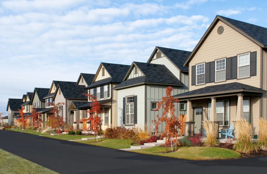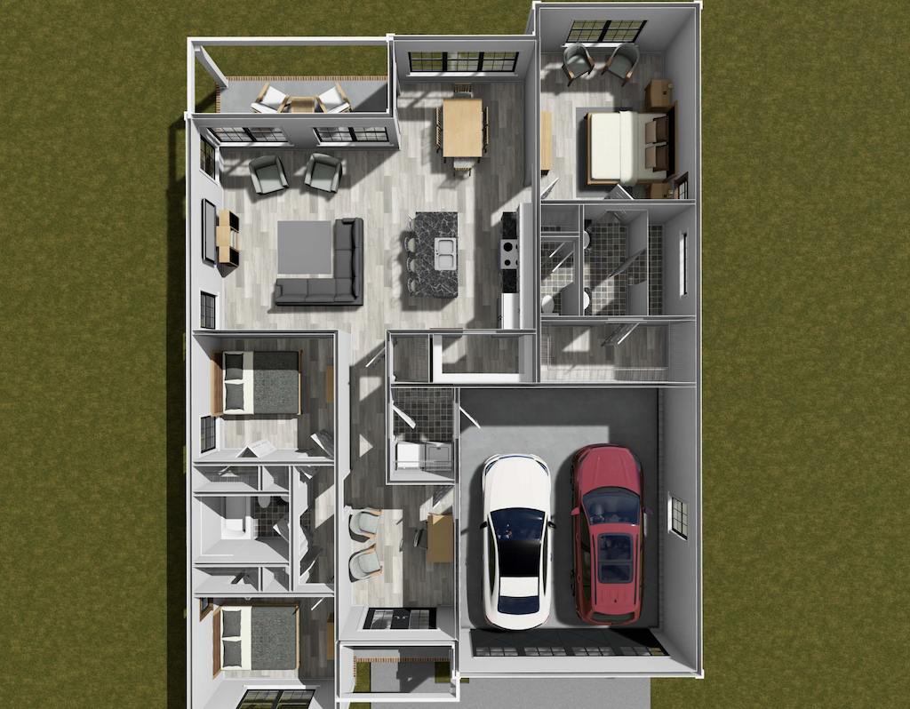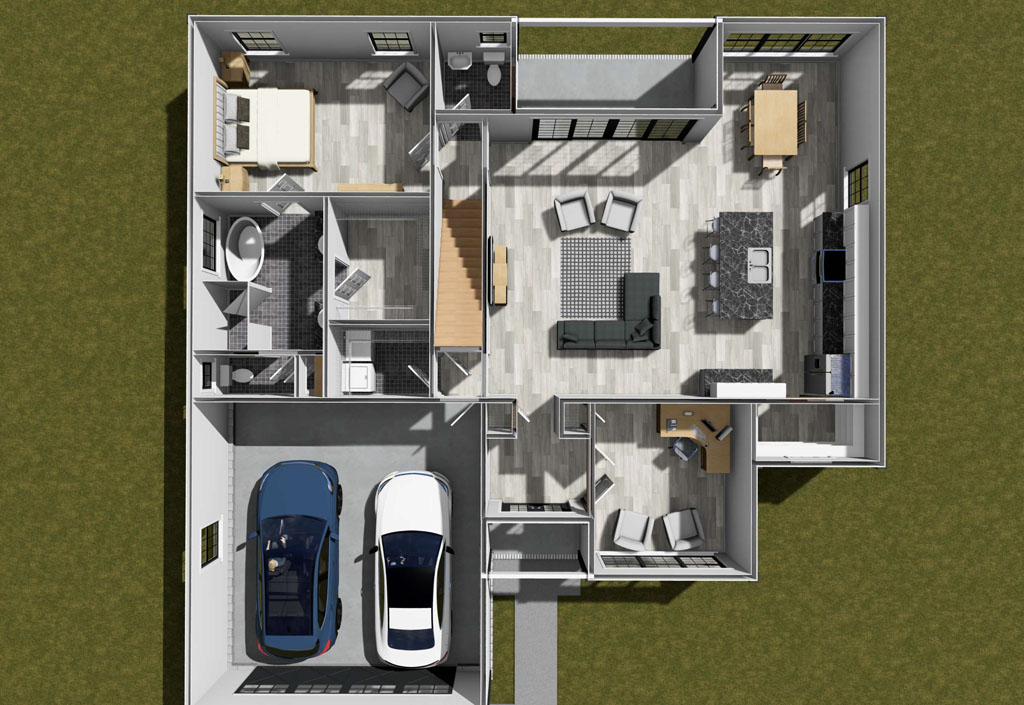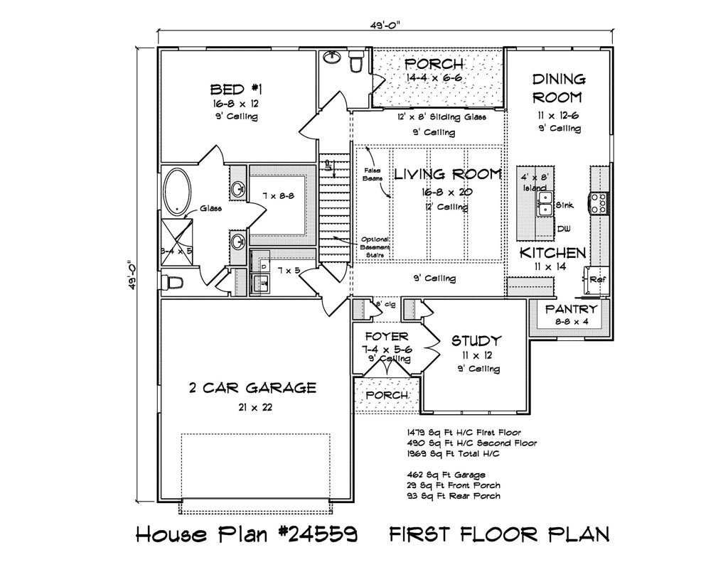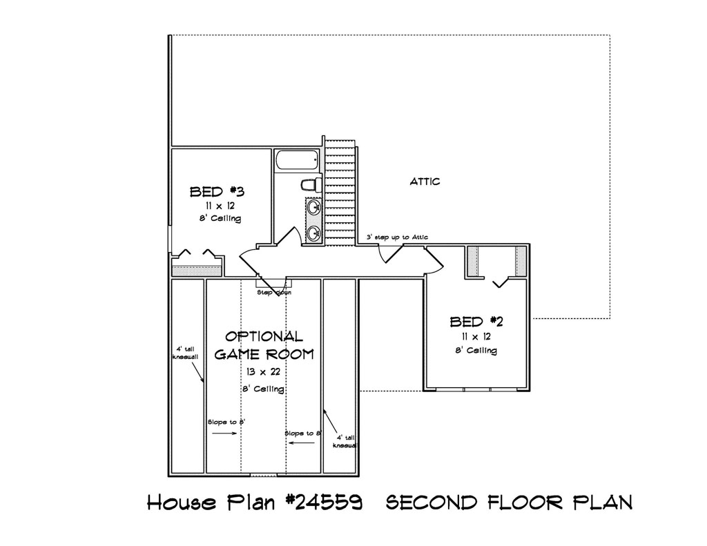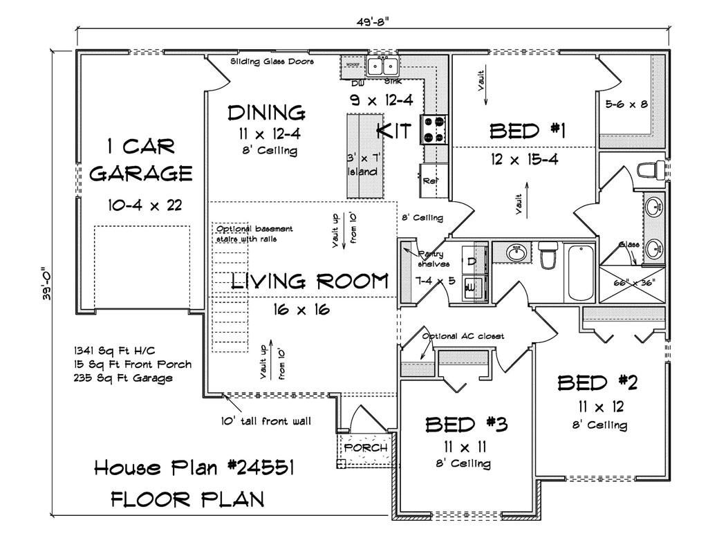
When you are building new, the floor plan and square footage carry a lot of weight. But the first thing buyers notice is not a bedroom count, it is the face of the home. Exterior color shapes that first impression, signals quality, and can even nudge the sale price. For developers working across entry level footprints up to about 2,500 square feet, a thoughtful color strategy is one of the most affordable ways to stand out on the street and online.
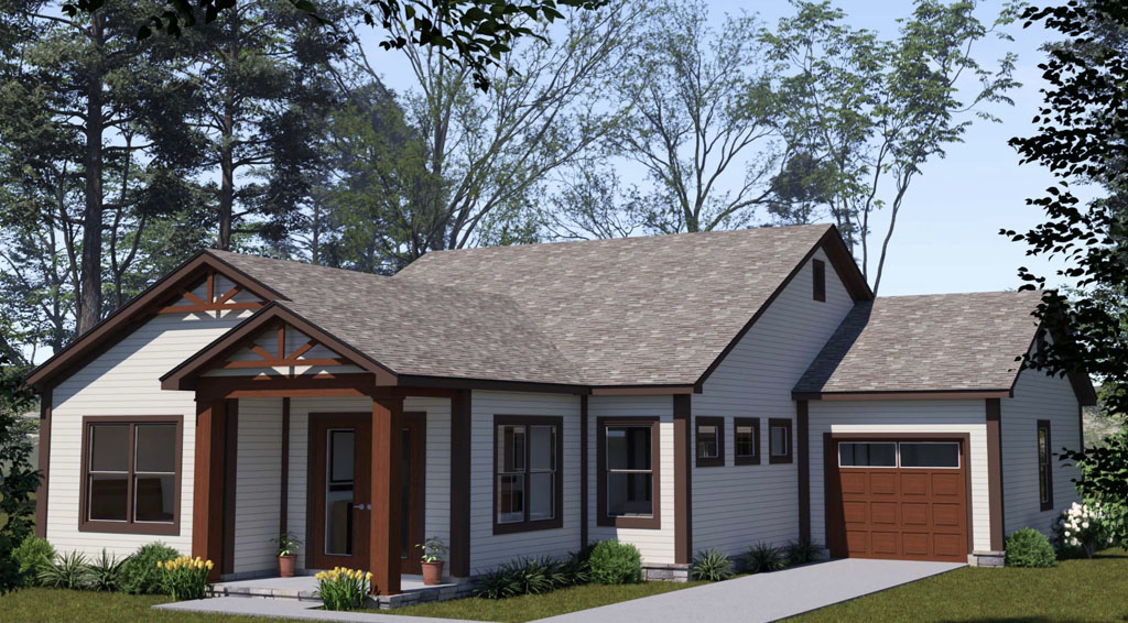
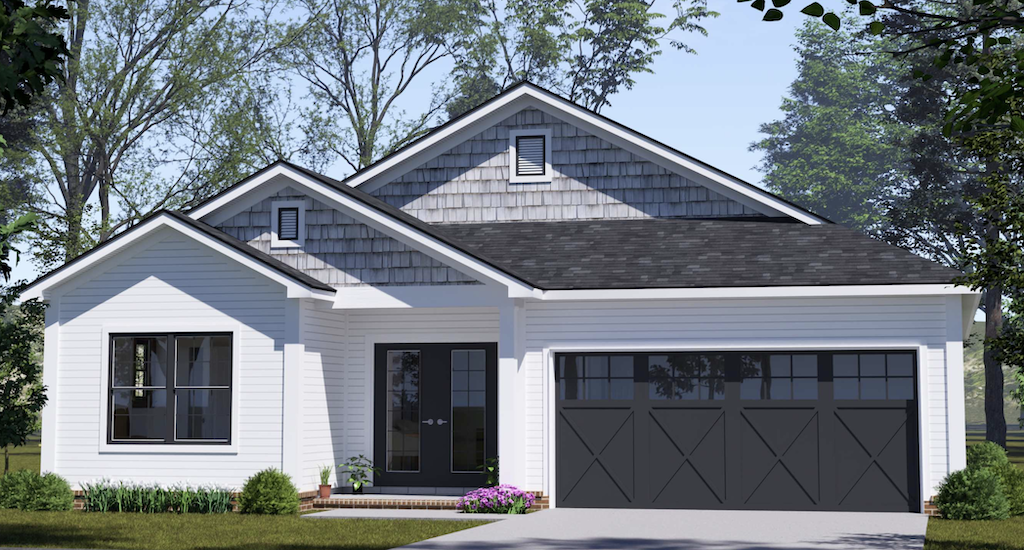
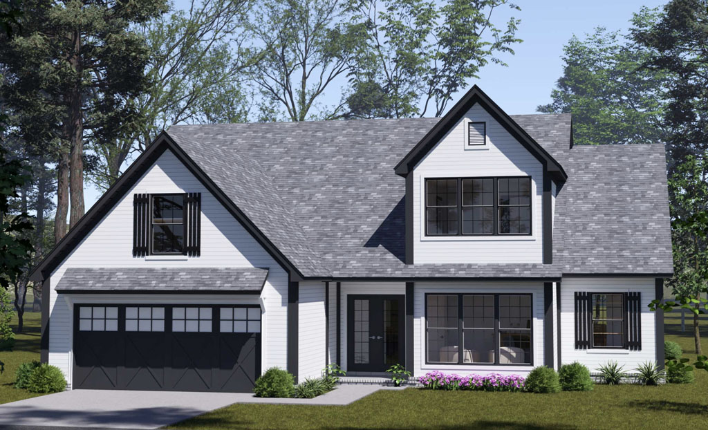
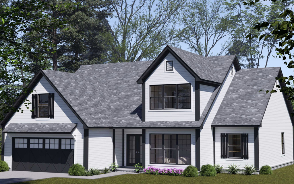
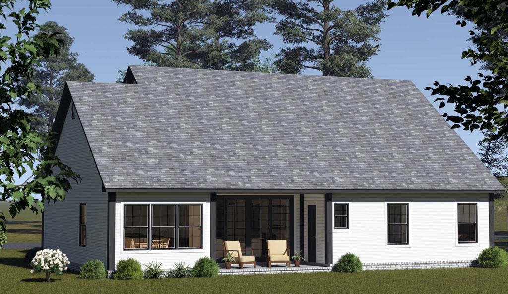
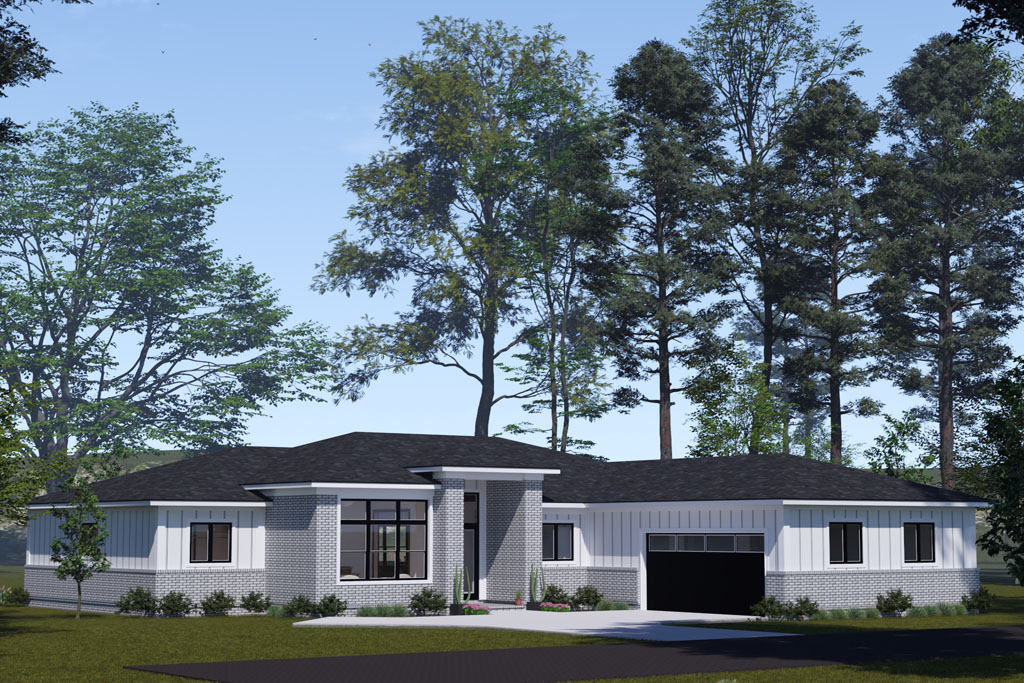
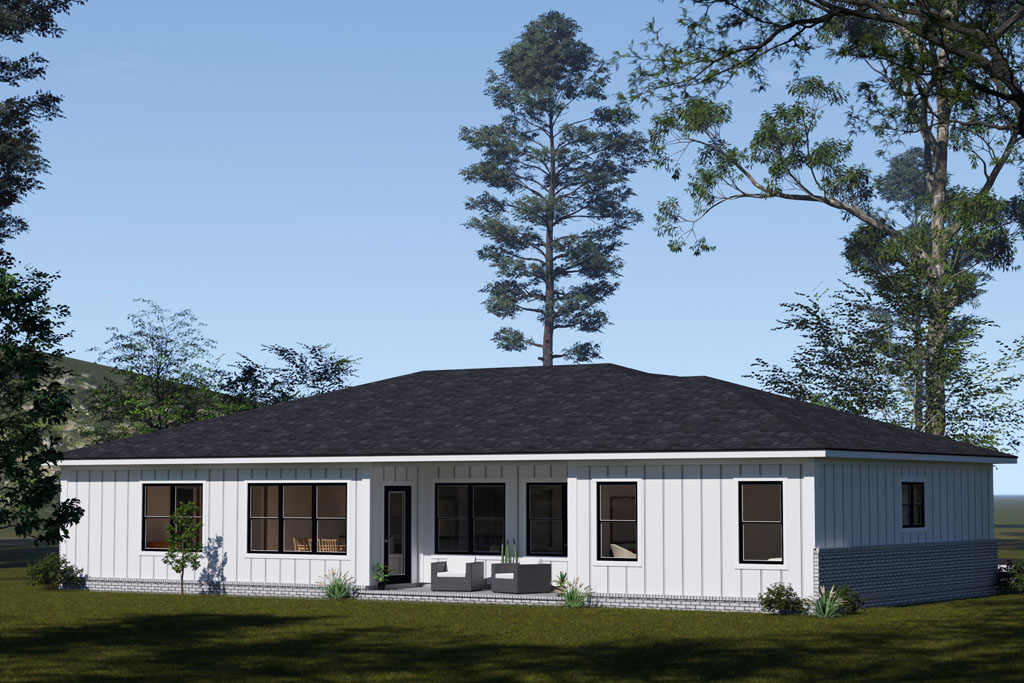
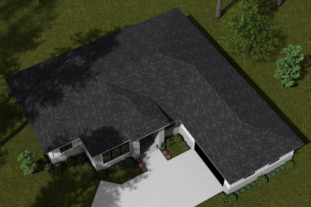
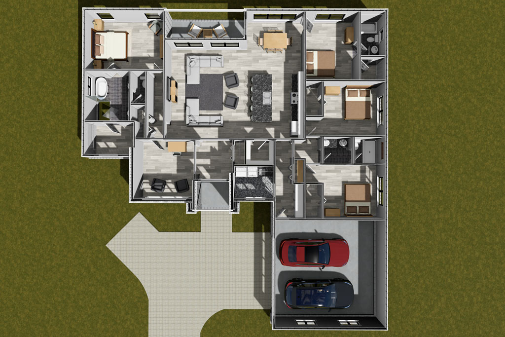
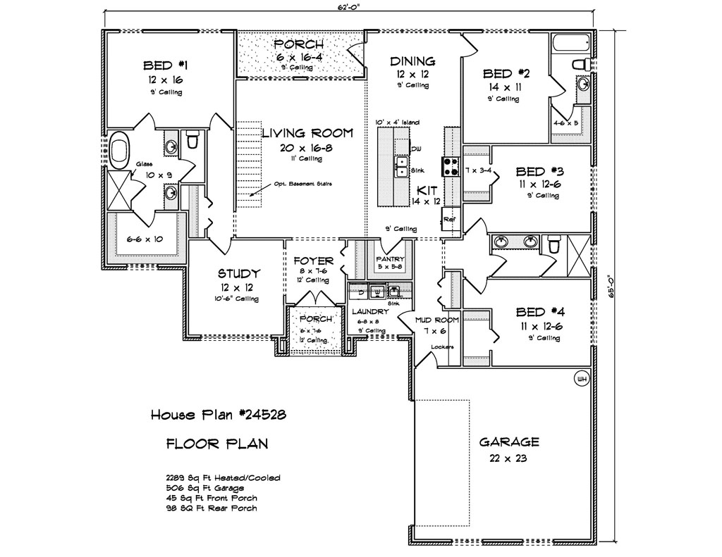
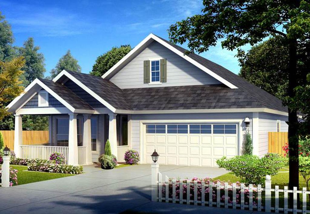
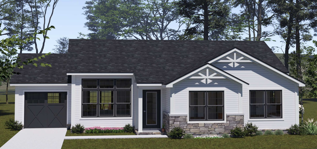
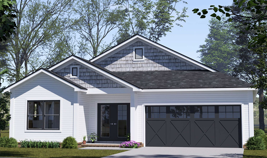
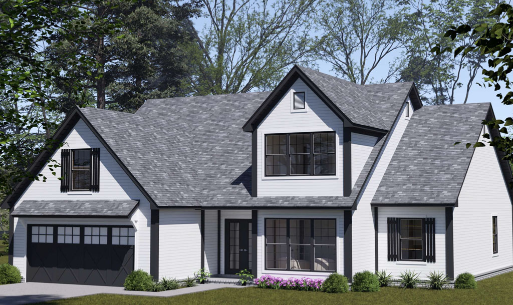
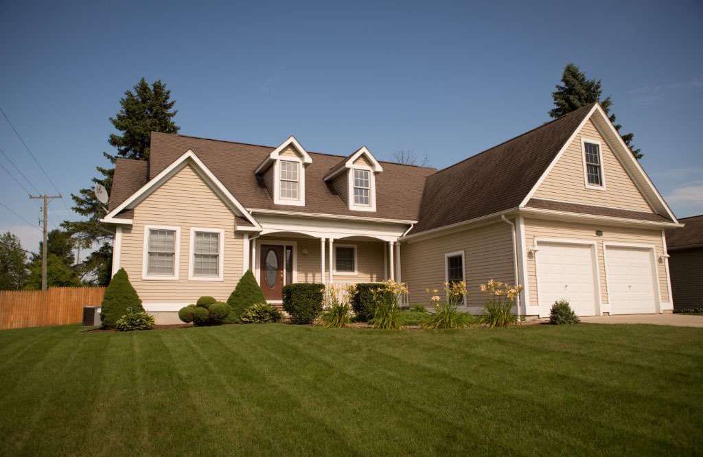
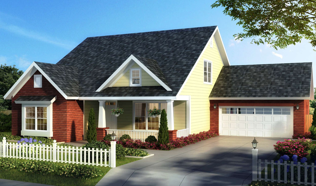
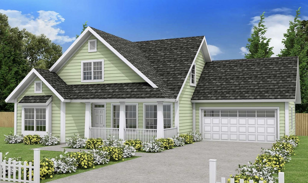
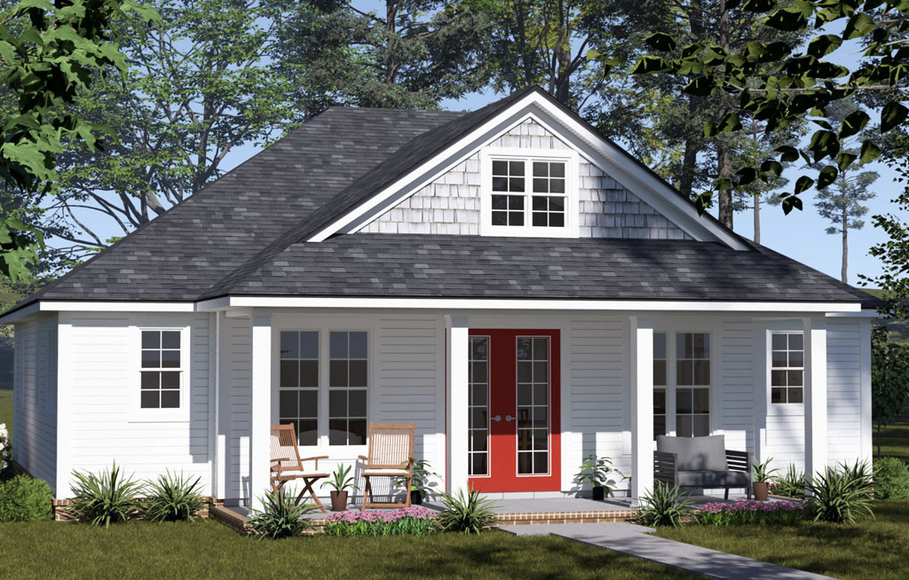
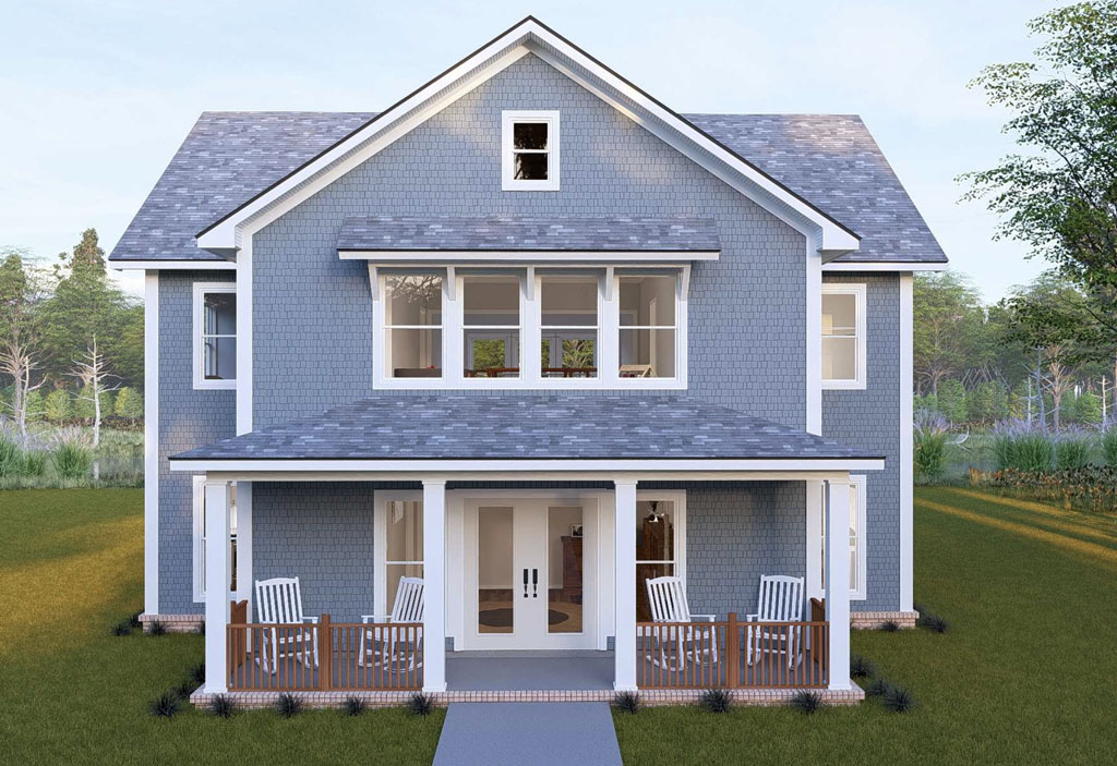
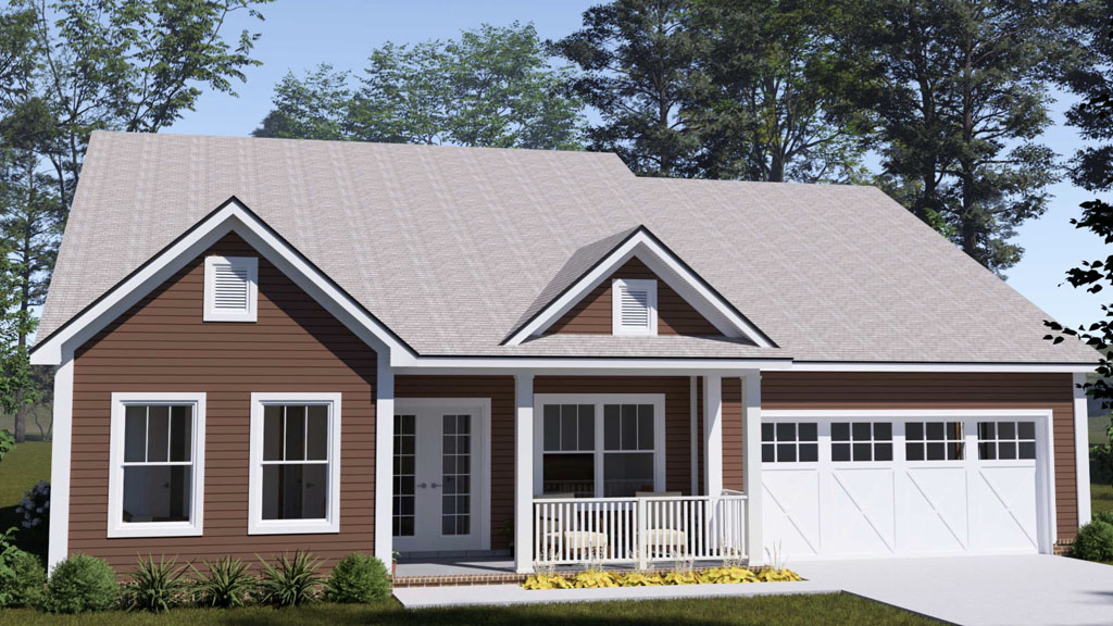
At W. L. Martin Home Designs, we lean into that idea. Dozens of plans on our site are rendered in unique color palettes that are chosen to spotlight architectural details like gables, brackets, dormers, and porches. From compact 400 to 1,000 square foot cottages to efficient 1,800 to 2,500 square foot family homes, you will see how the right palette can make a plan feel tailored and memorable.
Why color matters more than most people think
Color is not just visual, it is emotional. Calming blues and misty grays read clean and coastal. Earthy greens communicate nature and stability. Inky charcoals project modern confidence when paired with crisp trim. That emotional read happens fast, which is why high performing exteriors almost always combine a body color, a trim color, and a small accent for contrast.
Popular and trusted sources have been underscoring this for years. Zillow’s paint color research has repeatedly found correlations between certain exterior and door colors and stronger sale outcomes, including the widely cited finding that black front doors were associated with a bump of roughly several thousand dollars in sale price in earlier analyses. The National Association of Realtors has highlighted curb appeal projects, including exterior painting, as cost effective upgrades that improve buyer interest and help listings show better in photos and at open houses. Major paint brands like Sherwin Williams and Benjamin Moore keep pushing complex neutrals, desaturated greens, and near blacks because homeowner surveys show confidence in these palettes and strong perceived value when paired with modern windows and roofs.
The takeaway for builders is simple. Color is not just about liking navy more than tan. It can influence perceived quality, photo click through, and how fast your spec sells.
Modern color moves that are winning now
Here are palettes and pairings that buyers are responding to in new construction, pulled from trends covered by Houzz, HGTV, Architectural Digest, and the annual color direction from leading paint companies.
- Deep charcoal body, warm white trim, stained wood accents. Reads modern without feeling stark, works with black windows and standing seam roofing.
- Desaturated green body, stone base, satin black windows. Connects to the landscape and looks premium in wooded or lakeside settings.
- Creamy off white body, bronze metal accents, medium walnut door. A softer take on the modern farmhouse look with better long term versatility.
- Soft greige body, putty trim, slate roof tone. Classic and buyer friendly, photographs beautifully under both sun and overcast light.
- Navy or ink blue body, bright white trim, natural cedar brackets. High contrast that highlights gables and porch geometry.
- Two tone modern. Dark body at the main massing, lighter vertical siding in bump outs, and a color matched garage. Adds depth without feeling busy.
Front doors are a small but high impact move. Black, charcoal, deep teal, or a rich wood tone tend to test well because they frame the entry and anchor the elevation. Zillow’s earlier findings about black doors line up with what stagers and agents report in the field, that a dark, well finished door reads secure and upscale.
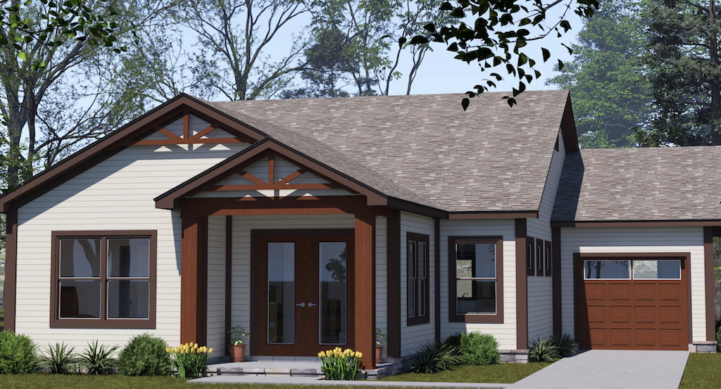
How color can showcase the architecture
Great plans deserve to be seen. Color placement is the trick.
- Use the body color to quiet the largest planes so the form reads cleanly.
- Use trim intentionally so rakes, fascias, and window casings pop in a controlled way. This is where a crisp white or warm off white earns its keep.
- Reserve the darkest value for the thinnest lines, for example window frames or metal accents. This creates definition without heaviness.
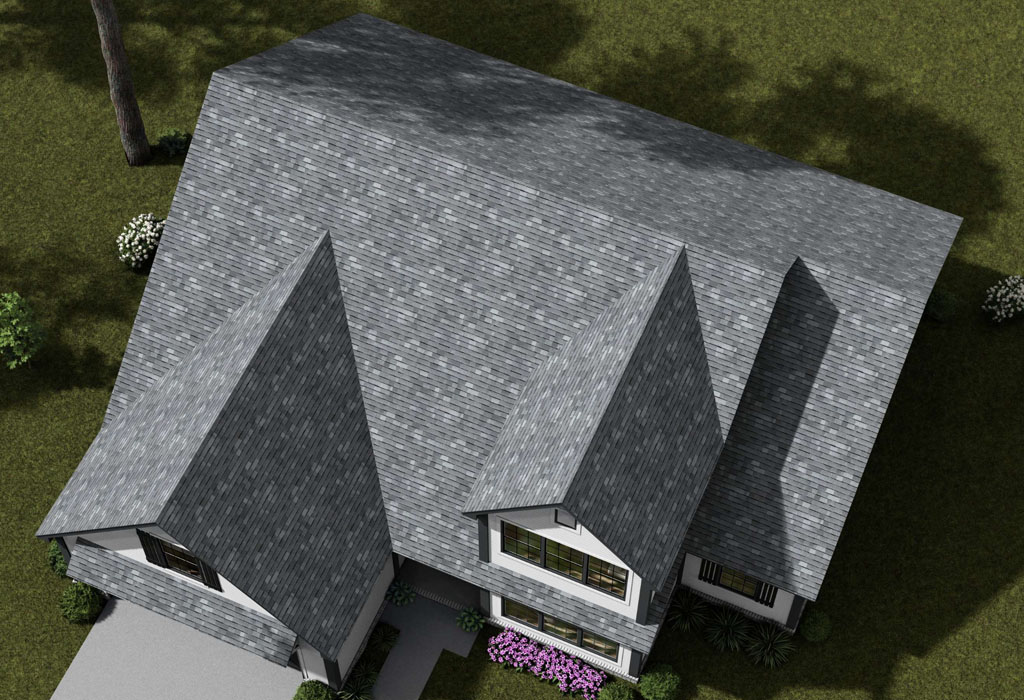
- Change siding orientation with color in mind. Vertical boards in a slightly lighter value can make a bump out feel taller. Horizontal lap in a deeper value can ground the mass.
- Treat stone and brick as colors, not just materials. Match undertones so the palette feels intentional.
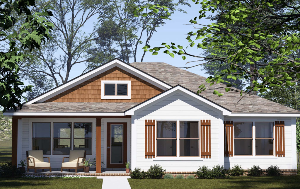
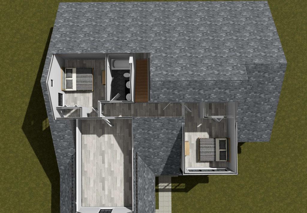
Across our catalog, you will see these tactics at work. Many W. L. Martin Home Designs plans use distinctive colorways to emphasize features like shed dormers on narrow lot cottages, timber brackets on mountain craftsman fronts, or the low, horizontal lines of modern prairie inspired elevations.
Data points developers like to know
You do not need an art degree to make a smart color choice. You just need to know what the market is already telling us.
- Zillow’s paint color analyses have tied specific shades to measurable sale premiums, including black doors associated with around a six thousand dollar lift in older studies, and deep grays testing well on modern exteriors when balanced by warm accents.
- The National Association of Realtors has reported that exterior paint upgrades are among the curb appeal projects that help homes show better and recover a meaningful portion of their cost at resale, especially when coordinated with simple landscaping and a clean entry sequence.
- Major paint brands publish annual homeowner surveys that consistently show strong buyer confidence in complex neutrals, muted greens, and near blacks on exteriors, with a preference for matte and satin sheens that photograph well.
Even when the exact premium varies by market and year, the pattern is steady. Tidy, modern palettes that feel coordinated tend to sell faster and with fewer concessions.
A quick, practical color process
Use this checklist to pick a market ready palette for your next build.
- Start with fixed elements. Roof color, stone, brick, and window finish are your anchors. Choose body and trim colors that complement those undertones.
- Consider light. Dark palettes look best with meaningful soffit lighting and generous window area. In full sun markets, slightly lighter values reduce fade and heat.
- Pick one moment. Choose either the door, shutters, or brackets to carry the accent. Restraint reads more expensive than scattering accents everywhere.
- Test big. Paint at least a two by two foot swatch on primed material and view it morning, noon, and dusk before approving.
- Mind maintenance. Satin or matte sheens hide imperfections better than glossy finishes, and mid tone colors show dust and pollen less than ultra darks in many climates.
- Think buyers. If the home sits under 1,800 square feet and targets first time buyers, lean classic with a little contrast. If it is a custom feeling spec near 2,500 square feet, you can push to a richer, moodier body color with warm accents.
How W. L. Martin plans make color work for you
Because so much of our portfolio is designed for efficient footprints, we prioritize elevations that gain presence from smart color. Dozens of W. L. Martin Home Designs plans on the site are shown with unique palettes that highlight the architecture, for example lighter gable insets that make rooflines read crisp, dark window frames that sharpen the grid, and warm wood tones that add a welcoming focal point at the entry. If you are browsing for a narrow lot plan or a build optimized for speed and value, these renderings double as ready made color roadmaps.
Exterior color is one of the simplest levers you can pull to boost curb appeal, improve listing photos, and help buyers fall in love before they reach the front step. The market data from sources like Zillow, NAR, and leading paint brands points in the same direction. Coordinated palettes with clear contrast and a single accent read newer, cleaner, and more valuable.
Ready to see how color can elevate your next build. Explore W. L. Martin Home Designs, where many plans already showcase colorways that do the heavy lifting, and use those palettes as a springboard for your lot, climate, and buyer profile.