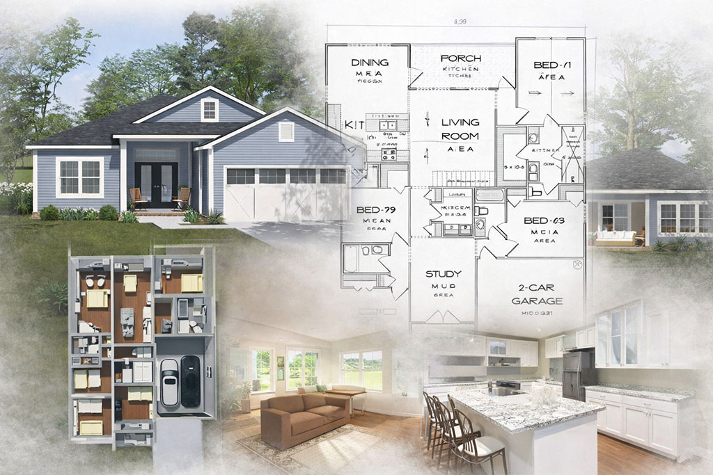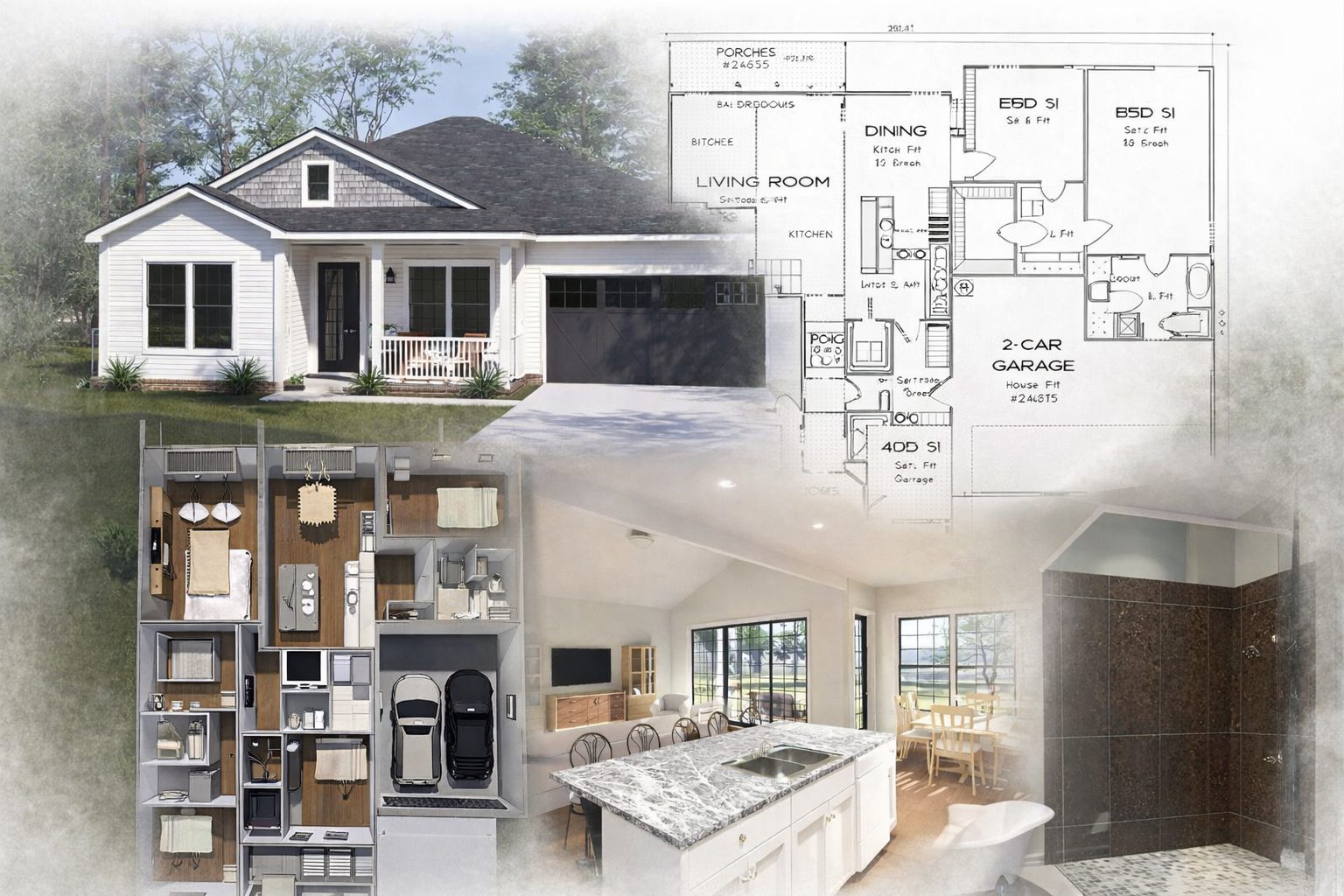
Choosing a new house plan is exciting, but it is also where costly mistakes often begin. Developers and first-time home buyers sometimes fall in love with a layout before asking the practical questions that matter most, such as whether the plan fits the lot, aligns with local code requirements, supports efficient construction, and delivers the kind of daily functionality people actually want. Guidance from respected industry groups like the National Association of Home Builders and the International Code Council consistently reinforces the importance of buildability, code awareness, and long-term livability when evaluating residential plans. A beautiful design matters, but a plan also needs to work in the real world.
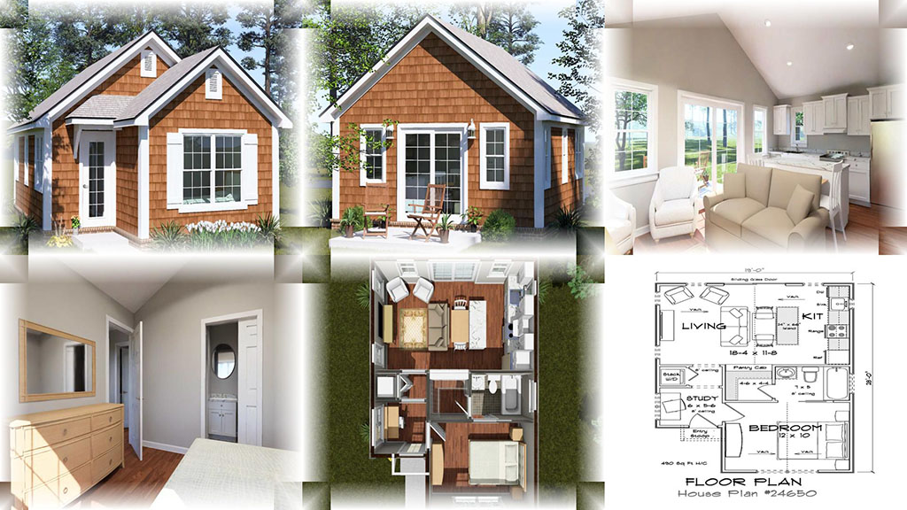
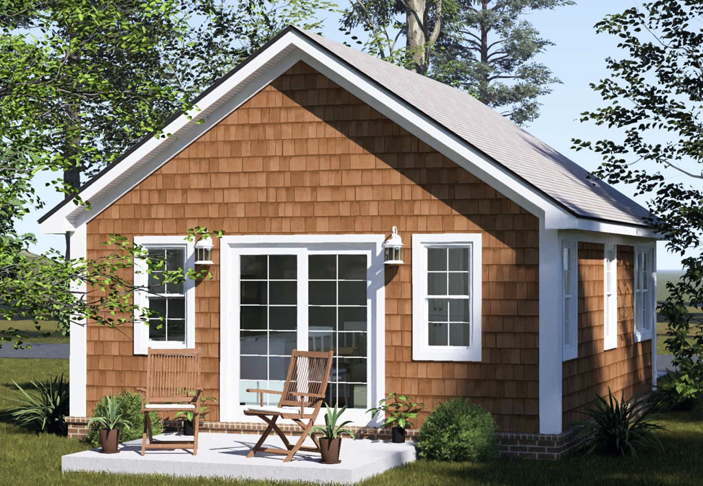
One of the most common mistakes is choosing a plan based on appearance alone without thinking through the site and the budget. A plan may look perfect online but create challenges if the lot is narrow, sloped, shallow, or subject to setbacks and local restrictions. Another issue is selecting a design with overly complex rooflines, unnecessary structural complications, or inefficient square footage that drives up construction costs without adding real value. Resources from the U.S. Department of Energy have long emphasized the value of smart layout decisions, energy-conscious design, and efficient use of space, all of which can help reduce operating costs and improve comfort over time.
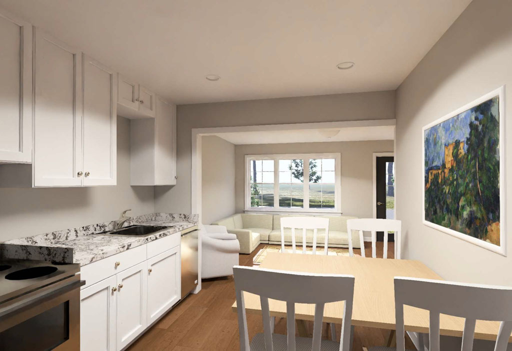
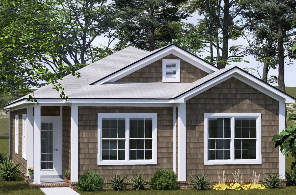
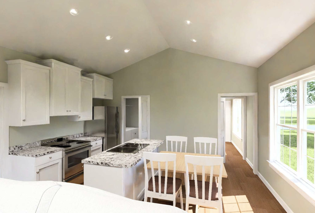
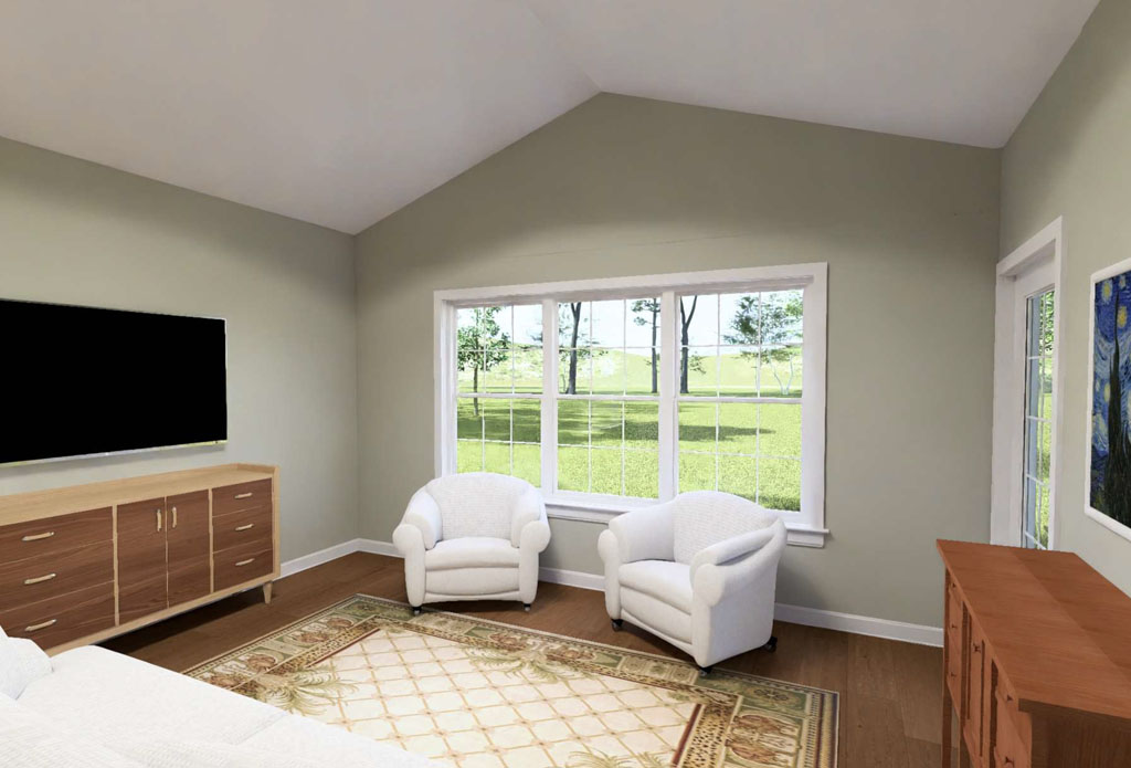
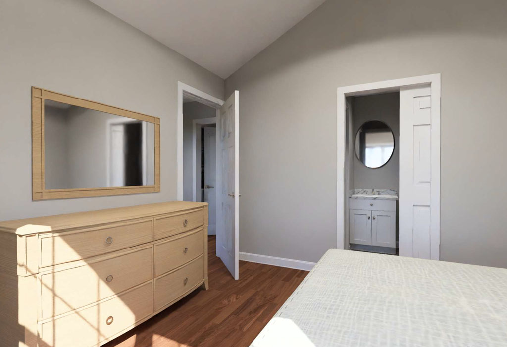
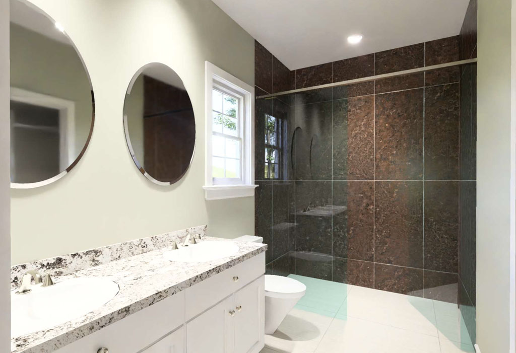
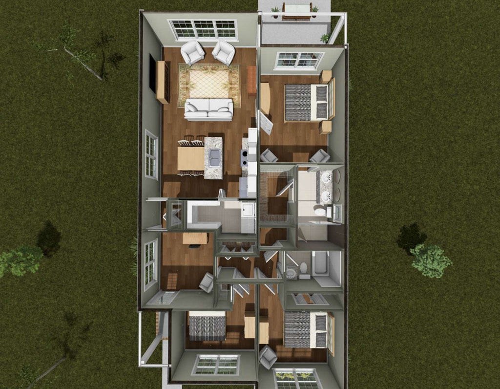
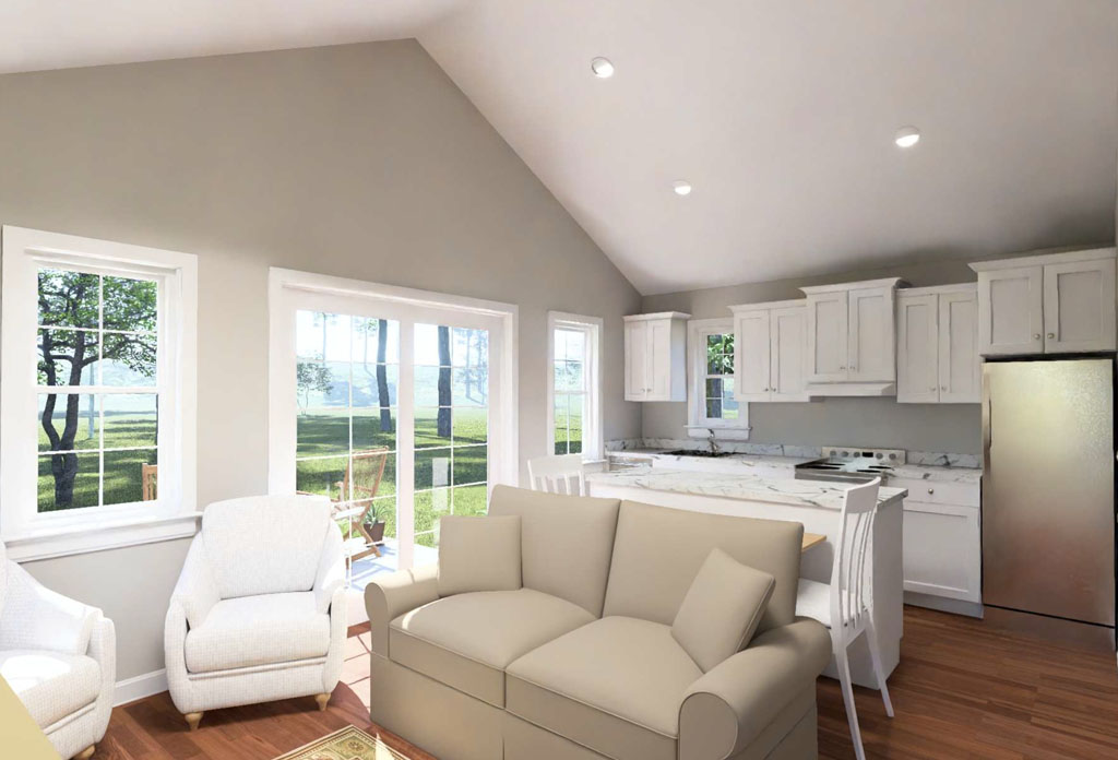
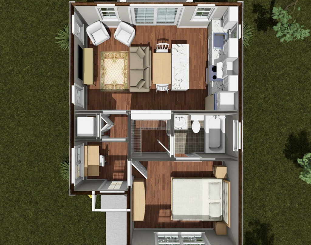
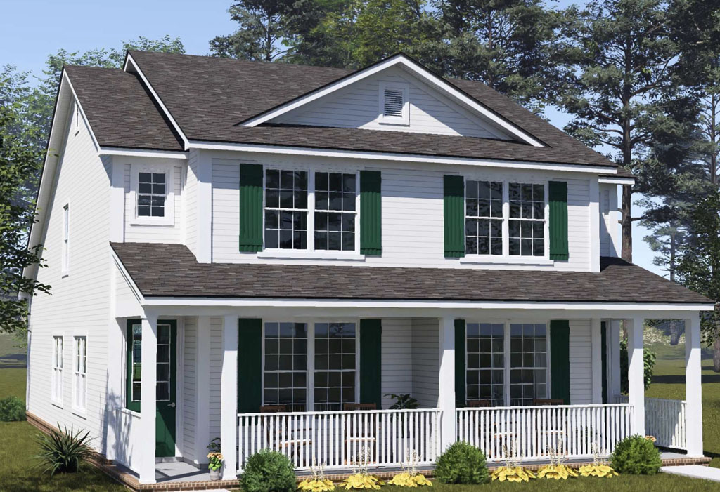
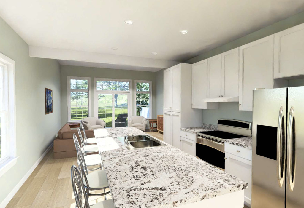
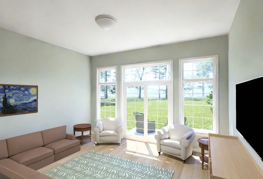
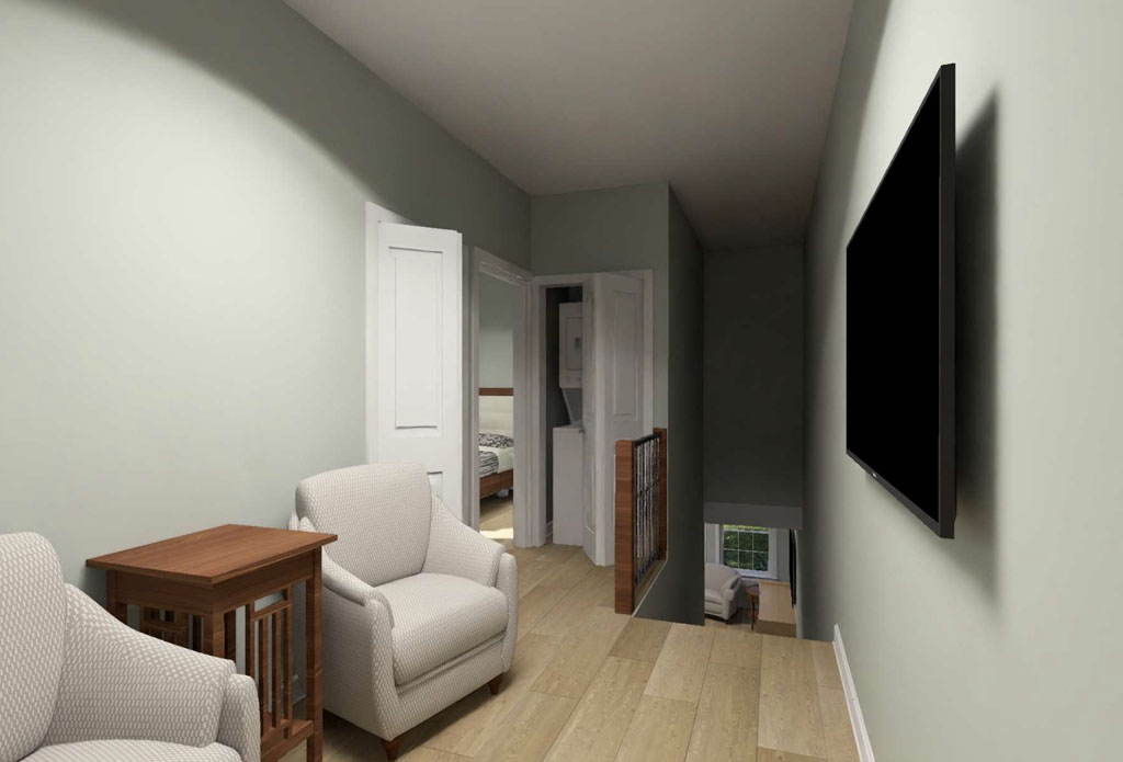
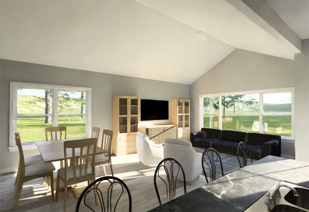
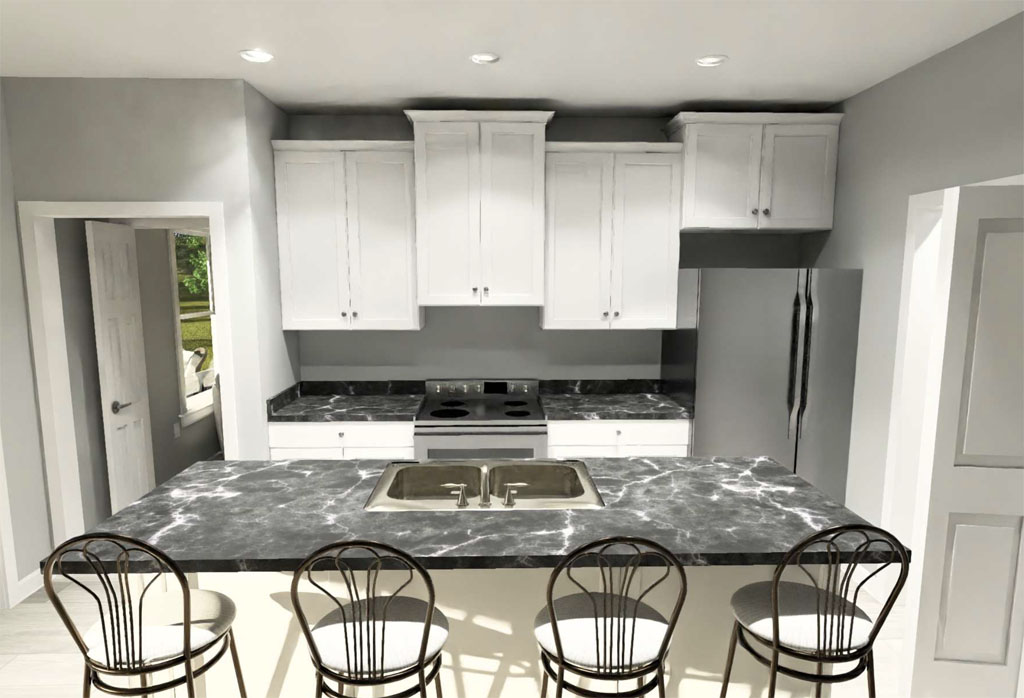
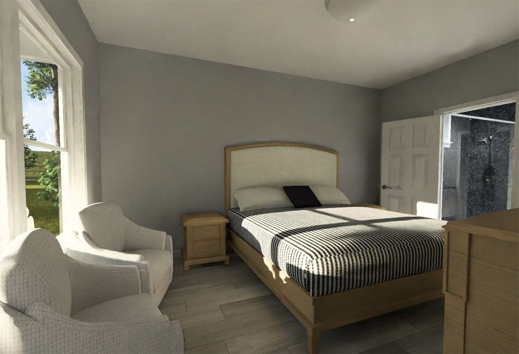
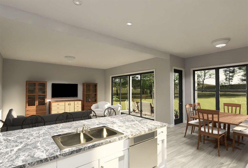
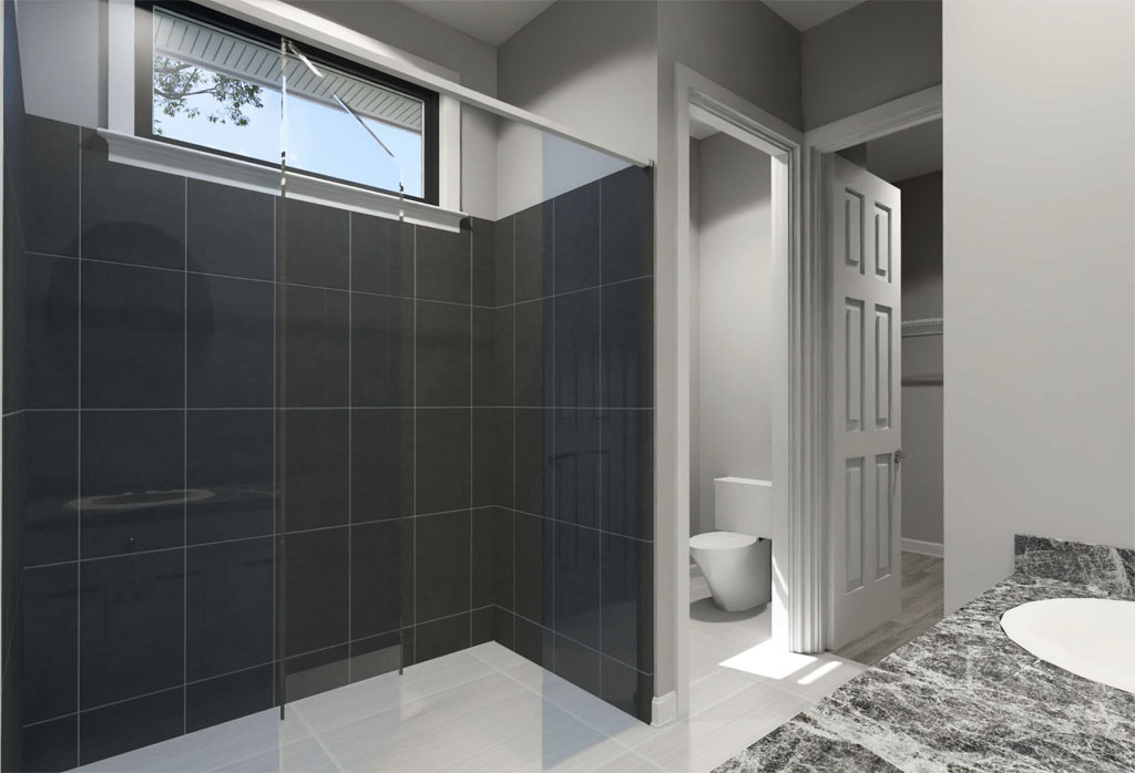
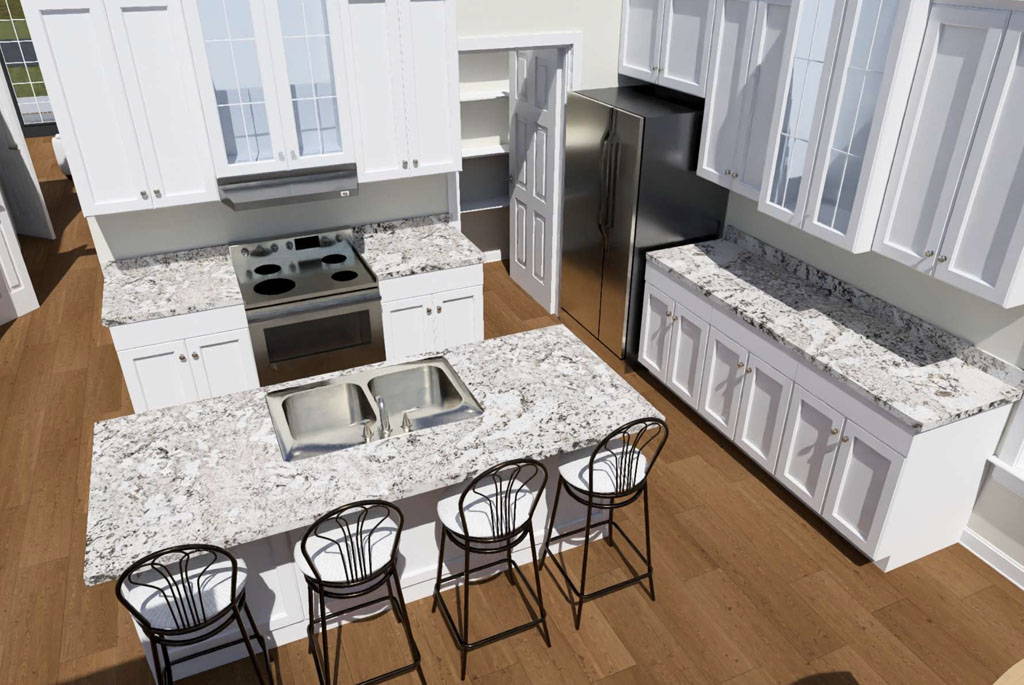
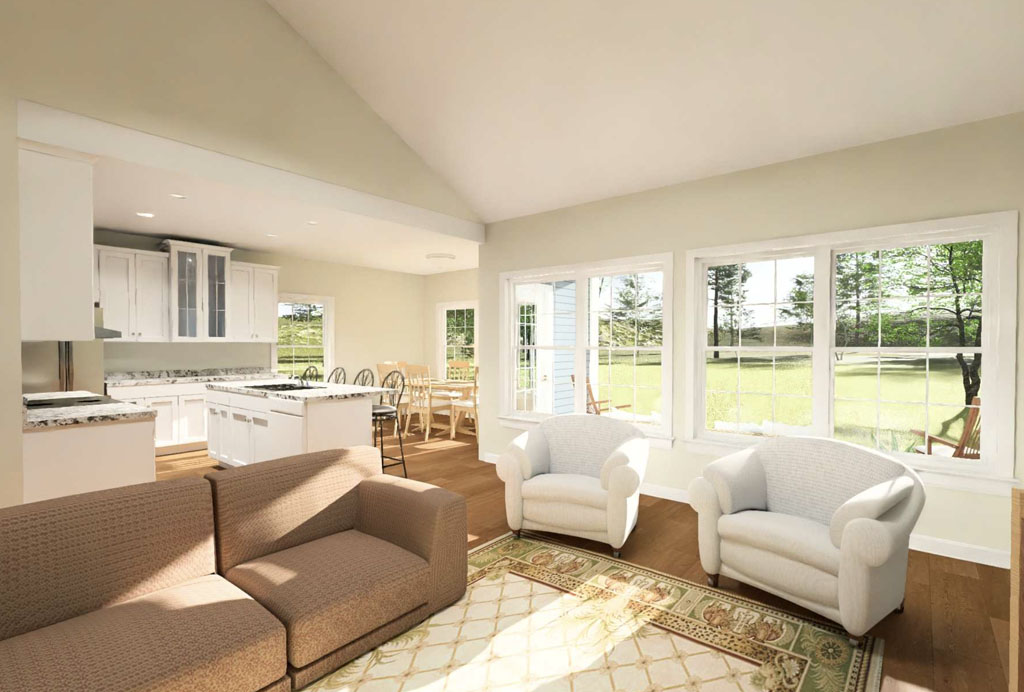
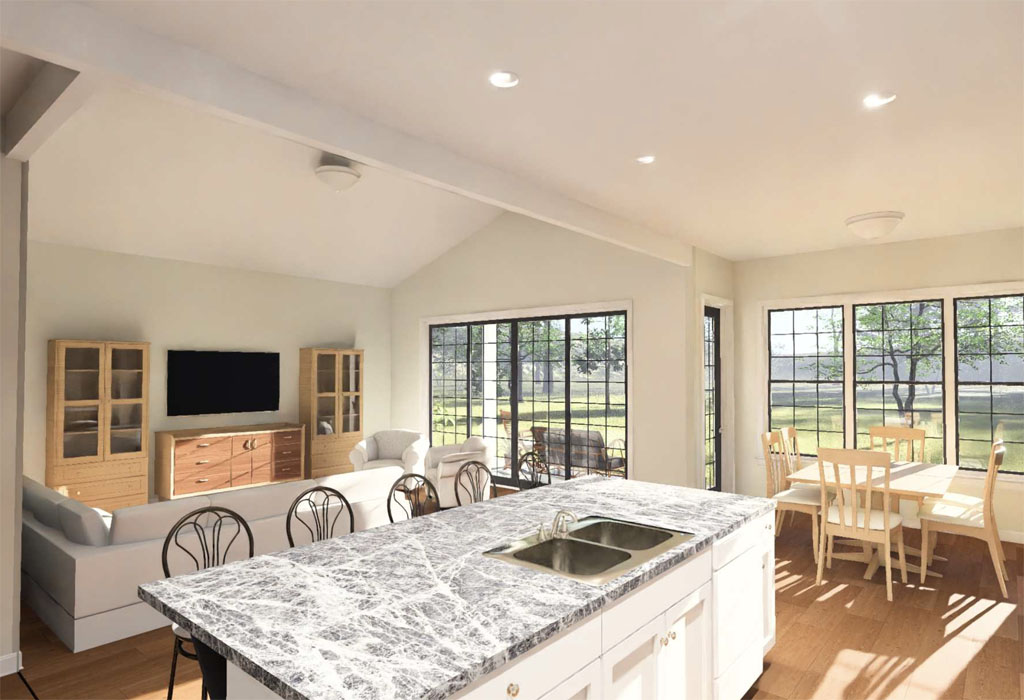
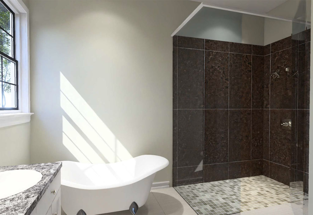
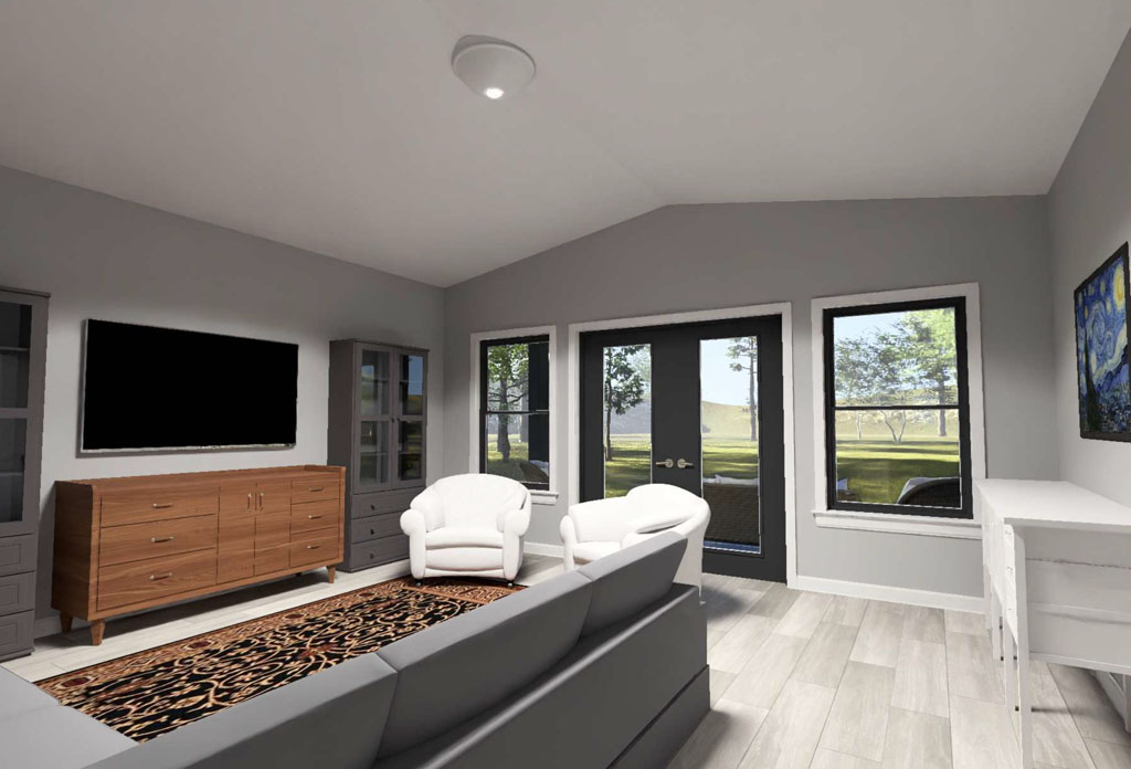
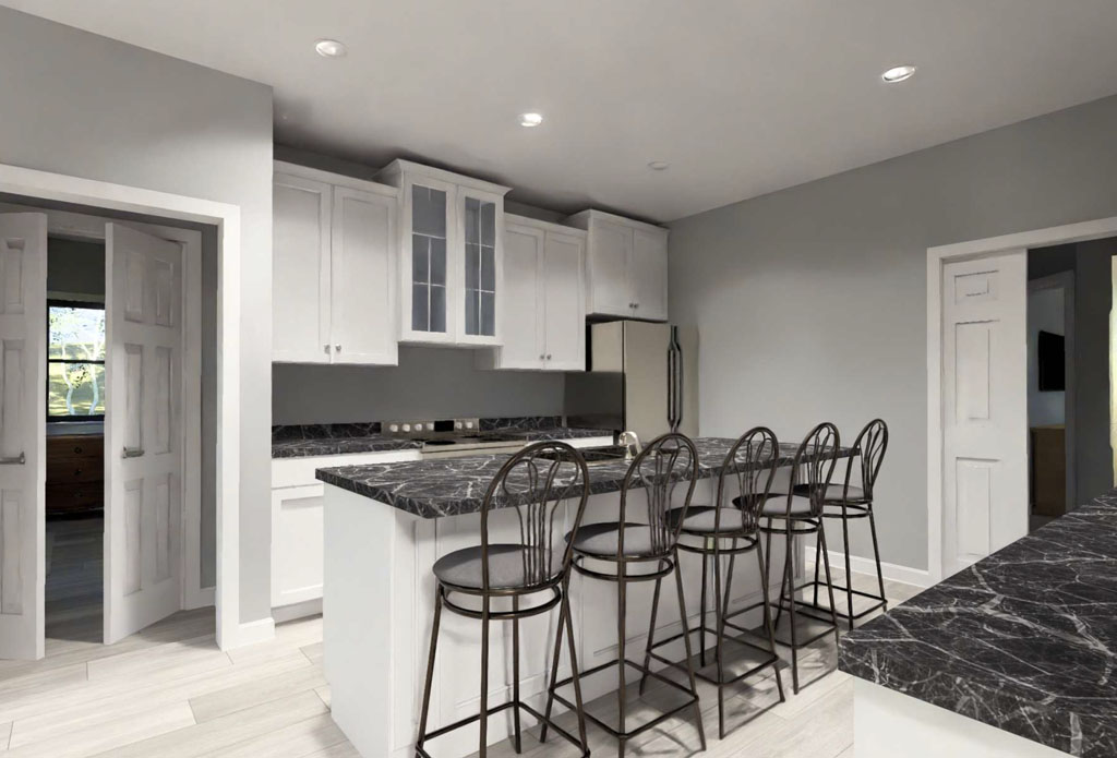
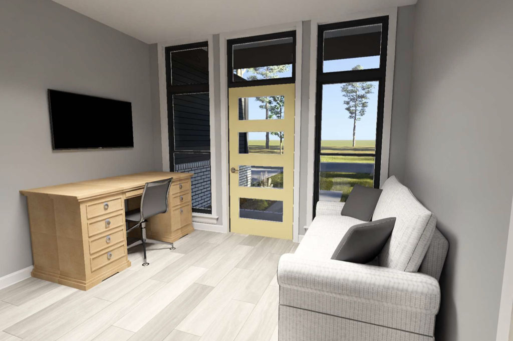
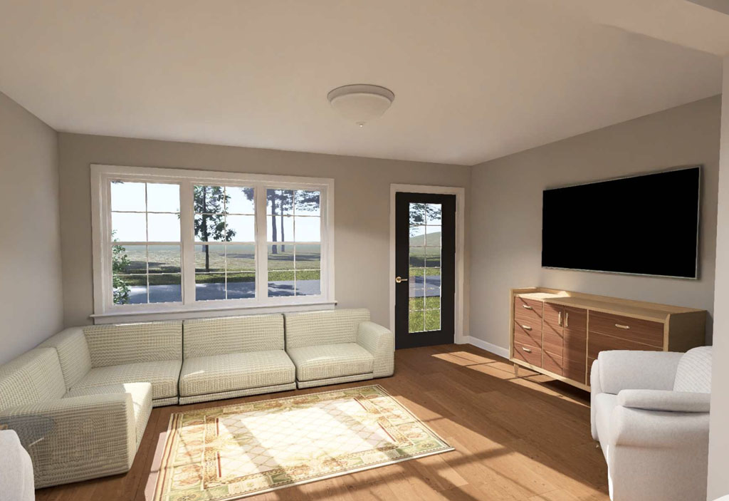
Buyers and developers also make the mistake of overlooking how a floor plan will function over the long term. Poor storage, awkward room placement, limited natural light, and weak kitchen or living room flow can all reduce a home’s appeal even if the exterior looks impressive. For developers, these issues can affect marketability and resale performance. For home buyers, they can lead to frustration after move-in when everyday living does not feel as easy as expected. The best house plans combine curb appeal with practical features that support modern living, future flexibility, and efficient construction from the start.
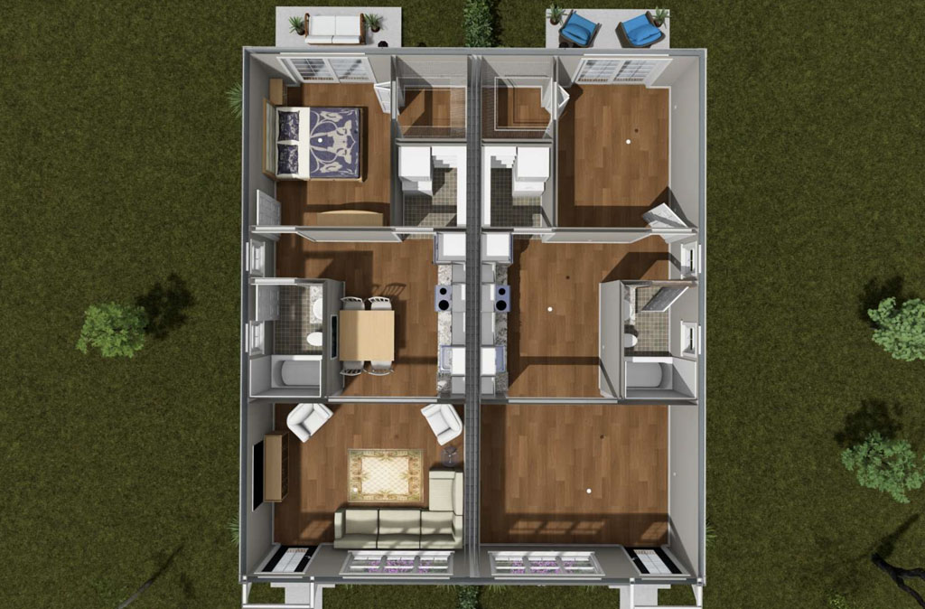
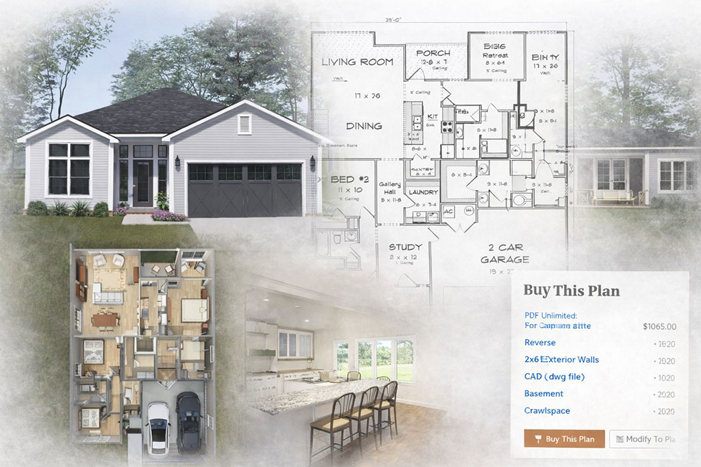
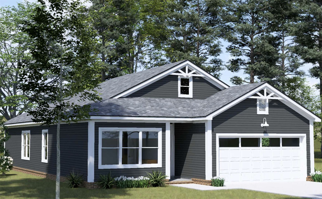
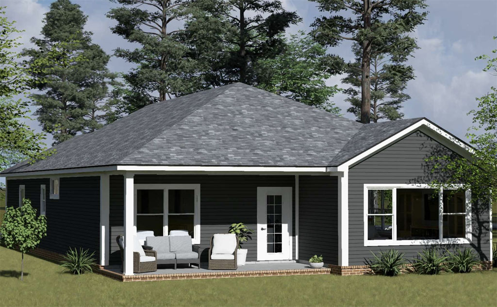
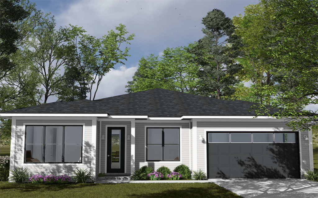
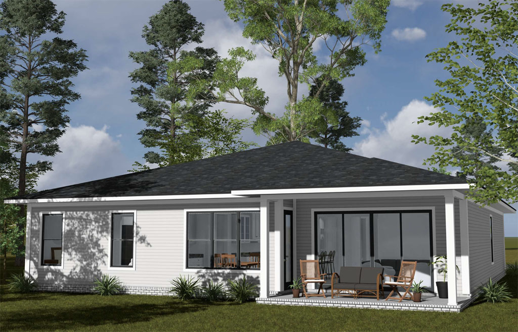
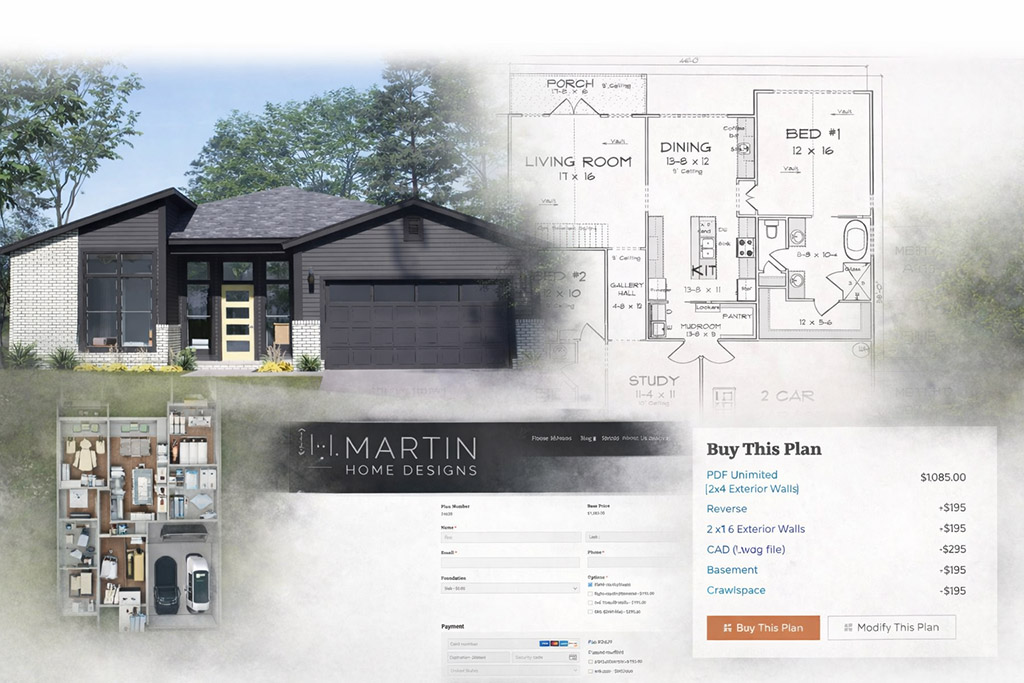
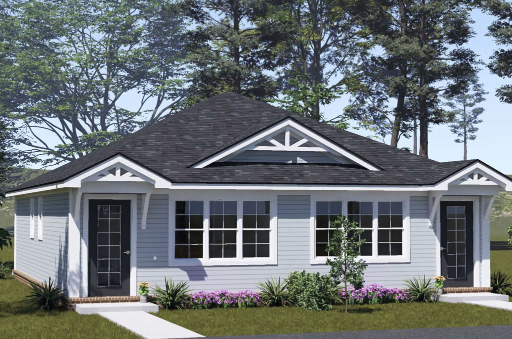
That is where choosing the right plan provider makes a real difference. W.L. Martin Home Designs offers house plans that help reduce these common mistakes by focusing on designs that are attractive, practical, and well-suited for real building conditions across North America. Whether you are a developer looking for plans that appeal to today’s buyers or a future homeowner searching for a layout that fits your lot and lifestyle, selecting from W.L. Martin Home Designs can give you a stronger starting point. Instead of settling for a plan that may need costly changes later, you can begin with a design created to support better decisions from day one.